import matplotlib.pyplot as plt
import numpy as np
import scipyWorking with numpy Matrices (Multidimensional Data)
Introduction
This task requires working with numpy matrices and Python to conduct a data analysis exercise involving body measurement data for males and females. The multidimensional body measurement data is loaded into a numpy matrix from a text file. Numpy vector operations are used to calculate the body mass index, append it to the matrix, and standardise the male data. Histogram and box plots were created using the Matplitlib library, and some descriptive statistics were calculated. A scatterplot matrix and matrices for Pearson’s correlation and Spearman’s rho were produced to allow visual and quantitative inspection of the associations between each variable.
Data input
Excerpts giving the body measurements of adult males and females from the National Health and Nutrition Examination Survey (NHANES dataset) have been used for this analysis. The data was downloaded from a GitHub repository as two CSV files:
- nhanes_adult_male_bmx_2020.csv
- nhanes_adult_female_bmx_2020.csv
These files are loaded into two numpy 2-dimensional arrays using the numpy.loadtxt function. The first 19 lines of the files contain header information and were ignored during the loading.
# Load the male data
male = np.loadtxt("nhanes_adult_male_bmx_2020.csv", skiprows=19, delimiter=",")

# load the female data
female = np.loadtxt("nhanes_adult_female_bmx_2020.csv", skiprows=19, delimiter=",")

# Names for columns
data_column_labels = np.array(["weight", "height", "upper arm len.", "upper leg len.",
                               "arm circ.", "hip circ.", "waist circ.", r"BMI", ])
Helper function to calculate body mass index
Now that we have the body measurement data loaded from the CSV files, we can calculate the BMI for each observation in the datasets. This is done in the helper function calculate_bmi. Using slicing, we select the columns representing the weight and height measurements and pass them to the function. Take care that the units of the data match those required in the function. The function uses numpy vector operations to calculate the BMI and return it as a numpy vector. This is conducted for both the male and female data arrays.
def calculate_bmi(weight, height):
    """
    Calculates the BMI for a person given the weight (kg) and height (m) using the traditional
    method.

    The formula is BMI = weight/height^2

    :param weight: A numpy vector of the weight of the person in kilograms.
    :param height: A numpy vector of the height of the person in meters.
    :return: A numpy vector containing the traditional BMI.
    """
    # Handle any input type errors
    # Check if weight is an integer or float

    # We only need to check one value in vector as numpy requires all data to be the same type
    if not (np.issubdtype(weight[0].dtype, np.floating) or np.issubdtype(weight[0].dtype, np.integer)):
        raise Exception(f"Weight is not a number, the type provided is {type(weight[0])}")

    # Check height can be converted to a float
    if not (np.issubdtype(height[0].dtype, np.floating) or np.issubdtype(height[0].dtype, np.integer)):
        raise Exception(f"Height is not a number, the type provided is {type(height)}")

    # At this point, both input variables are known to be numbers. Now check they have the
    # appropriate range.
    if np.min(weight) <= 0:
        raise Exception(f"The persons weight must be greater than zero. "
                        f"At least one zero or lower value detected.")
    if np.min(height) <= 0:
        raise Exception(f"The persons height must be greater than zero."
                        f" At least one zero or lower value detected.")

    # Calculate the BMI
    persons_bmi = weight / height ** 2

    return persons_bmi
# Calculate the BMI using the calculate_bmi function
# Column 0 is the weight, and column 1 is the height, making sure we convert height from cm to m
bmi_male = calculate_bmi(male[:, 0], male[:, 1] / 100)
bmi_female = calculate_bmi(female[:, 0], female[:, 1] / 100)Now, we have numpy vectors containing the BMI values for the males and females. We can add these as a column to the original dataset using the numpy.column_stack function. In this case, I have stored the result in a new array for each gender. However, you could choose to overwrite the original array if you wish.
# Add the BMI as a column to the raw data and store the result in a new 2-dimensional array.
male_data = np.column_stack((male, bmi_male))
female_data = np.column_stack((female, bmi_female))
Histogram Plots
Histogram plots for the female and male BMIs are produced using Matpliblib.pyplot.hist with 20 bins. The plots are created as subplots in a single figure with the same x-axis limits to allow visual inspection and comparison of the distribution of each dataset (see below). The plots have been coloured to help distinguish between them.
num_bins = 20

# Create figure with specified size
hist_fig = plt.figure(figsize=(11, 7))

# Plot female
ax1 = plt.subplot(2, 1, 1)  # 2 rows, 1 column, 1st subplot
ax1.hist(female_data[:, 7], num_bins, edgecolor="hotpink", color="deeppink")
ax1.set_title(f"Female BMIs (n={female_data.shape[0]})")

# Plot male
ax2 = plt.subplot(212, sharex=ax1)  # 2 rows, 1 column, 2nd subplot
ax2.hist(male_data[:, 7], num_bins, edgecolor="lightskyblue", color="dodgerblue")
ax2.set_title(f"Male BMIs (n={male_data.shape[0]})")

# Set the x limit for both plots
plt.xlim(10, 70)
plt.show()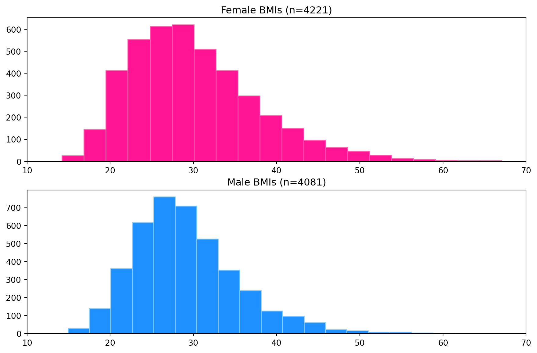
Box Plots
Box plots for each dataset have been produced to compare distributions from a descriptive statics viewpoint visually. The left side of the box is the first quartile, the right side is the third quartile, and the white line inside the box is the median. The box length represents the inter-quartile range (IQR) and represents 50% of the data. The whiskers are placed at 1.5*IQR above and below the third and first quartiles. Values outside the whiskers are termed outliers.
The Matplotlib.pyplot.boxplot function was used to create the plot. The figure size was adjusted to reduce the vertical white space and increase its width. Again, the box plots have been coloured to help distinguish each dataset.
plt.figure(figsize=(11, 4))
labels = ["Male", "Female"]
colours = ["dodgerblue", "deeppink"]
bplot = plt.boxplot([male_data[:, 7], female_data[:, 7]], vert=False, patch_artist=True,
                    tick_labels=labels, medianprops=dict(color="white", linewidth=1.5))

# Fill with colors
for patch, colour in zip(bplot["boxes"], colours):
    patch.set_facecolor(colour)

# Set the x-axis limits
plt.xlim(10, 70)
plt.show()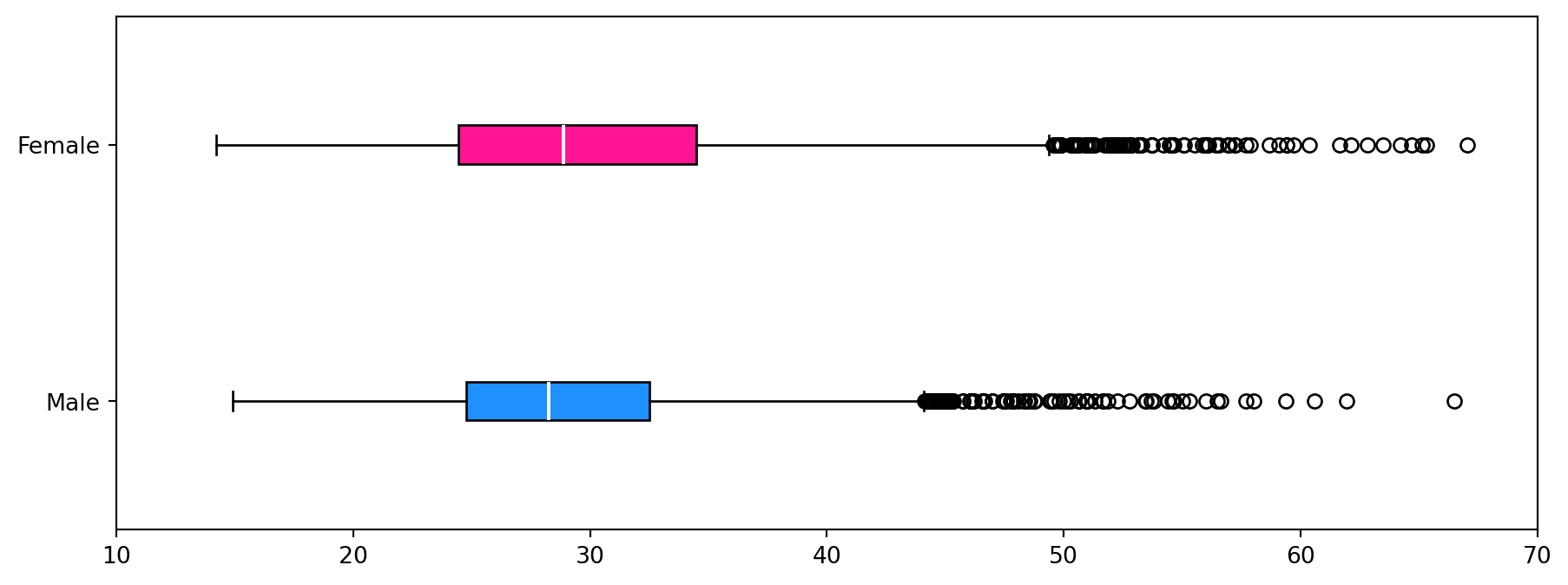
Descriptive Statistics for the BMI data
The following descriptive statistics are calculated using the helper function stats_describe function that returns a dictionary:
- Arithmetic mean
- Median
- Minimum
- Maximum
- Standard deviation
- Inter-quartile range (IQR)
- Skewness
- Number of observations in the data
def stats_describe(a):
    """
    Compute several descriptive statistics of the passed array. This function borrows ideas from
    the scipy.stats.describe function.

    :param a: Input 1-d data array.

    :return: A dictionary containing the descriptive statistics for the input data,
        a_mean: Arithmetic mean of `a`.
        a_median: Arithmetic mean of `a`.
        a_min: Minimum value of `a`.
        a_max: Maximum value of `a`.
        a_std: Standard deviation of `a` using ddof=1
        a_iqr: Inter-quartile range value of `a`.
        a_skew: Skewness value of `a`.
        n: Number of observations in the data
    """

    if a.size == 0:
        raise ValueError("The input must not be empty.")

    n = a.shape[0]
    a_min = np.min(a, axis=0)
    a_max = np.max(a, axis=0)
    a_mean = np.mean(a, axis=0)
    a_median = np.median(a, axis=0)
    a_std = np.std(a, axis=0, ddof=1)
    a_iqr = scipy.stats.iqr(a, axis=0)
    a_skew = scipy.stats.skew(a, axis=0, bias=True)

    return {"mean": a_mean, "median": a_median, "min": a_min, "max": a_max, "std": a_std,
            "IQR": a_iqr, "skew": a_skew, "num. obs.": n}
Calculate the descriptive statistics for both male and female body mass indices.
male_stats = stats_describe(male_data[:, 7])
female_stats = stats_describe(female_data[:, 7])
Print the descriptive statics in a table-like format.
# Spacing to help with formatting of the printing
padding = 10

# Print the header
print("Descriptive Statistics for BMI data")
print(f"##                female      male")

# Iterate over dictionary keys, printing the information for each gender for each key.
for key in female_stats.keys():
    #
    if key == "mean":
        print(f"## BMI {key:<{padding}}{round(female_stats[key], 2):7.2f}   "
              f"{round(male_stats[key], 2):7.2f}")
    elif key == "num. obs.":
        print(f"##     {key:<{padding}}{round(female_stats[key], 0):7g}   "
              f"{round(male_stats[key], 0):7g}")
    else:
        print(f"##     {key:<{padding}}{round(female_stats[key], 2):7.2f}   "
              f"{round(male_stats[key], 2):7.2f}")
Descriptive Statistics for BMI data
## female male
## BMI mean 30.10 29.14
## median 28.89 28.27
## min 14.20 14.91
## max 67.04 66.50
## std 7.76 6.31
## IQR 10.01 7.73
## skew 0.92 0.97
## num. obs. 4221 4081From the histogram plot, the distribution of BMI for females is unimodal and skewed to the right (higher BMI values). For males, the distribution is unimodal and skewed to the right. The box plots show the median BMI (white line in the boxes) for females is higher than for males. Comparing the box length shows that the female BMI distribution has a larger spread than the males. This is also observed visually in the histograms but is easier to identify in the box plots. Both distributions show many outliers on the right side of the distribution and none on the left. The conclusions from the visual inspection of the plots can be verified by inspection of the descriptive statistics.
Standardising the data
We can standardise the data by subtracting the mean from each element and dividing it by the standard deviation. Here we use the vectorised functionality of numpy to do the standardisation for each measurement (column) in a single command. We constrain the operations to the columns by setting axis=0 in the mean and std operations.
Here we are standardising only the male data.
zmale = (male_data - np.mean(male_data, axis=0)) / np.std(male_data, axis=0)The pair_plot function plots a matrix of scatter plots of several variables against each other. These are useful for visually identifying associations between variables.
def pair_plot(a, data_labels, ax_labels, alpha=0.3):
    """
    Draws a scatter plot matrix, given a data matrix, column data_labels, and column units.

    This function is modified from section 7.4.3 of Gagolewski M. (2025).

    Reference:
    Gagolewski M. (2025), Minimalist Data Wrangling with Python, Melbourne,
        DOI: 10.5281/zenodo.6451068, ISBN: 978-0-6455719-1-2,
        URL: https://datawranglingpy.gagolewski.com/.

    :param a: data matrix,
    :param data_labels: list of column names
    :param ax_labels: list of data_labels for axes
    :param alpha: transparency
    """
    # Get the number of columns
    k = a.shape[1]

    # The number of columns in X must match the number of data_labels provided
    assert k == len(data_labels)

    # Create the figure and axes for subplots
    fig, axes = plt.subplots(nrows=k, ncols=k, sharex="col", sharey="row", figsize=(10, 10))
    for i in range(k):
        for j in range(k):
            ax = axes[i, j]
            if i == j:  # diagonal
                ax.text(0.5, 0.5, data_labels[i], transform=ax.transAxes,
                        ha="center", va="center", size="medium")
            else:
                ax.scatter(a[:, j], a[:, i], s=10, color="dodgerblue", edgecolor="lightskyblue",
                           alpha=alpha, zorder=2)
                ax.grid(zorder=1, alpha=0.5)

            # Print the column axes labels only on the left side and bottom of the pair-plot figure
            if j == 0:
                ax.set_ylabel(ax_labels[i], fontsize=10)
            if i == len(data_labels) - 1:
                ax.set_xlabel(ax_labels[j], fontsize=10)
    fig.tight_layout()
Create the pair plot for the standardised male data.
# Plot the height, weight, waist circumference, hip circumference, and BMI
columns_to_plot = [1, 0, 6, 5, 7]

# Labels for axes
axes_labels = np.array(["z"] * 8)

# Create the plot using the `pair_plot` function
pair_plot(zmale[:, columns_to_plot], data_column_labels[columns_to_plot],
          axes_labels[columns_to_plot], alpha=0.8)
plt.show()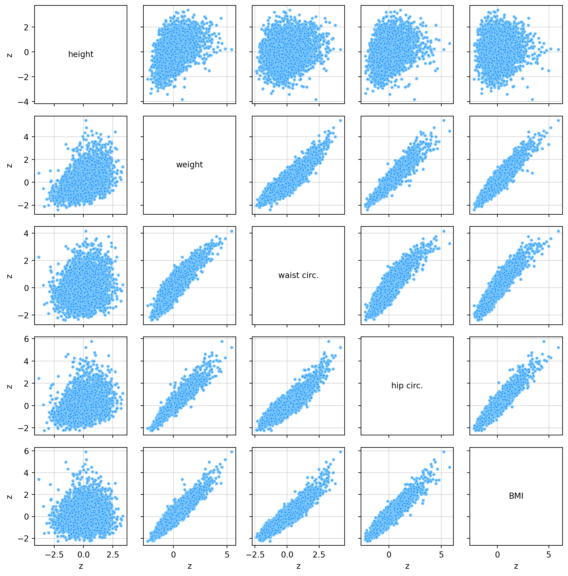
Pearson Correlation and Spearman’s Rho
The Pearson correlation measures the strength of the linear association between two quantitative variables (De Veaux et al., 2020 p. 200). The correlation values will be between -1 and 1. Positive values indicate a positive association, e.g., when one variable increases, the other also increases. Negative values indicate a negative association, e.g., when one variable increases, the other decreases. Spearman’s Rho correlation uses the Pearson correlation on the rank of the values of two variables (De Veaux et al., 2020 p. 206). It also has values between -1 and 1. Spearman’s rho uses the rank of the variables to measure the consistency of the trend (monotonic relationship) between the two variables. Pearson’s correlation is sensitive to strong outliers, whereas Spearman’s rho is not.
def corrheatmap(a, data_labels, lbl_set_dict):
    """
    Draws a correlation heat map, given a matrix of numbers and a list of column names.

    This function is modified from section 9.1.2 of Gagolewski M. (2025).

    Reference:
    Gagolewski M. (2025), Minimalist Data Wrangling with Python, Melbourne,
        DOI: 10.5281/zenodo.6451068, ISBN: 978-0-6455719-1-2,
        URL: https://datawranglingpy.gagolewski.com/.

    :param a: - matrix of numbers for all variable pairs.
    :param data_labels: list of column names
    :param lbl_set_dict: a dictionary of settings indicating whether data_labels should be turned
    on or off for different aspects of the plots
    """
    # Get number of rows in the input array
    k = a.shape[0]

    # Number of rows must equal the number of columns and the number of data_labels provided.
    assert a.shape[0] == a.shape[1] and a.shape[0] == len(data_labels)

    # plot the heat map using a custom colour palette
    # (correlations are in [-1, 1])
    plt.imshow(a, cmap=plt.colormaps.get_cmap("RdBu"), vmin=-1, vmax=1)

    # Add text data_labels
    for i in range(k):
        for j in range(k):
            plt.text(i, j, f"{a[i, j]:.2f}", ha="center", va="center",
                     color="black" if np.abs(a[i, j]) < 0.5 else "white", size="medium", weight=550)

    plt.xticks(np.arange(k), labels=data_labels, rotation=30)
    plt.tick_params(axis="x", which="both",
                    labelbottom=lbl_set_dict["labelbottom"], labeltop=lbl_set_dict["labeltop"],
                    bottom=lbl_set_dict["bottom"], top=lbl_set_dict["top"])

    plt.yticks(np.arange(k), labels=data_labels)
    plt.tick_params(axis="y", which="both",
                    labelleft=lbl_set_dict["labelleft"], labelright=lbl_set_dict["labelright"],
                    left=lbl_set_dict["left"], right=lbl_set_dict["right"])

    # Turn off grid lines
    plt.grid(False)
Generate a correlation heat map for Pearson’s correlation and Spearman’s rho for the standardised male data.
plt.figure(figsize=(11, 11))
R = np.corrcoef(zmale, rowvar=False)

ax1 = plt.subplot(1, 2, 1)  # 1 rows, 2 column, 1st subplot
label_settings = {"labelbottom": True, "labeltop": False, "bottom": True, "top": False,
                  "labelleft": True, "labelright": False, "left": True, "right": False
}
corrheatmap(R[np.ix_(columns_to_plot, columns_to_plot)], data_column_labels[columns_to_plot],
            label_settings)
ax1.set_title("Pearsons's r")

ax2 = plt.subplot(1, 2, 2)  # 1 rows, 2 column, 2nd subplot

label_settings = {"labelbottom": True, "labeltop": False, "bottom": True, "top": False,
                  "labelleft": False, "labelright": True, "left": False, "right": True
}

rho = scipy.stats.spearmanr(zmale)[0]
corrheatmap(rho[np.ix_(columns_to_plot, columns_to_plot)], data_column_labels[columns_to_plot],
            label_settings)
ax2.set_title(r"Spearman's $\rho$")

plt.show()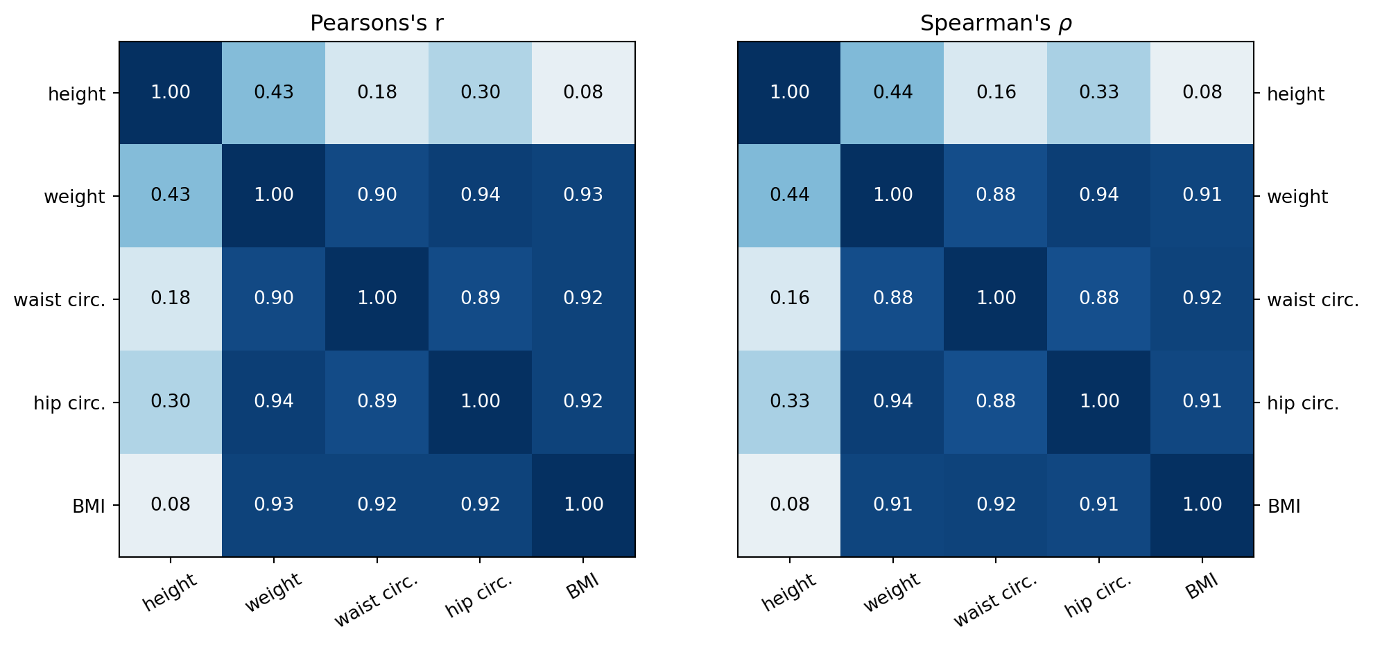
From the pair plot and the heat maps above, the following can be said regarding the associations between the height, weight, waist circumference, hip circumference and BMI variables.
- BMI has a strong positive linear association (r > 0.8) with weight, waist circumference and hip circumference and a very weak (0 < r < 0.1) positive linear association with height.
- Hip circumference has a strong positive linear association with weight and waist circumference and a weak ( 0.1 < r < 0.5) positive linear association with height.
- Waist circumference has a strong positive linear association with weight, hip circumference, and BMI and a weak positive linear association with height.
- Weight has a weak positive linear association with height.
- There are a couple of reasons why the weight, waist circumference and hip circumference have a strong association with BMI, whereas height has a weak association.
- The formula for BMI is weight divided by height squared. This creates a stronger relationship with weight over height.
- Fat distribution is more likely associated with waist and hip circumferences than height. Since weight increases with fat percentage, there is going to be a strong association between weight, waist and hip circumference. This is shown with the correlation coefficients between weight and these variables being greater than 0.9. Since there is a strong association between BMI and weight, any other quantity that has a strong association with weight will also have a strong association with BMI.
- The Spearman’s rho values are similar to the Pearson correlation values for both the strong and weak associations.
- For the strong associations this suggests the association between the variables is primarily linear.
- For the weak and below associations, this suggests that neither a linear nor monotonic association is present between theariables.s.
Summary
This Jupyter Notebook demonstrates the use of numpy matrices, vectors, and functions to analyse body measurement data quantitatively using descriptive statistics and visually using histograms, box plots, and scatter plot matrices.
Possible extensions to the data analysis include: - Add a standard model curve to the histogram plots to visually compare with the standard model. - Consider doing linear regression on the data to see if a predictive model for BMI can be produced from the body measurements.
References
[1] R. D. De Veaux, P. F. Velleman, and D. E. Bock, Stats: Data and Models. Hoboken, NJ: Pearson, 2020.