import os

# Set the environment variable to avoid the memory leak
# This needs to be set first
os.environ["OMP_NUM_THREADS"] = "4"

import pandas as pd
import numpy as np
import matplotlib.pyplot as pltUnsupervised Learning
Introduction
Part 1 - Obesity dataset
Data
The dataset used in this part is the Estimation of Obesity Levels Based On Eating Habits and Physical Condition from the UC Irvine Machine Learning Repository. The data is licensed under CC BY, allowing it to be freely used for this exercise. This dataset contains data for estimating obesity levels in individuals from Mexico, Peru and Colombia, based on their eating habits and physical condition. The data comprises 16 features and a labelled variable, NObesity, which classifies the level of obesity. There are seven classes of obesity levels.
Load data
The data is loaded into a pandas dataframe from the downloaded CSV file. After loading the data, the first five rows of the dataframe are inspected using the head() function. The dataframe is then checked for any missing values. This dataset is clean with no missing values.
# Load the data file into a dataframe
obesity_df = pd.read_csv("ObesityDataSet_raw_and_data_sinthetic.csv", comment="#")

# Drop the class label "Nobeyesdad"
obesity_df.drop("NObeyesdad", axis=1, inplace=True)

# Inspect the head of the data
print(obesity_df.head())

# Check how many null values are in the data frame
print()
print("Feature Name           Number of missing entries")
print(obesity_df.isnull().sum())
Gender Age Height Weight family_history_with_overweight FAVC FCVC \
0 Female 21.0 1.62 64.0 yes no 2.0
1 Female 21.0 1.52 56.0 yes no 3.0
2 Male 23.0 1.80 77.0 yes no 2.0
3 Male 27.0 1.80 87.0 no no 3.0
4 Male 22.0 1.78 89.8 no no 2.0
NCP CAEC SMOKE CH2O SCC FAF TUE CALC \
0 3.0 Sometimes no 2.0 no 0.0 1.0 no
1 3.0 Sometimes yes 3.0 yes 3.0 0.0 Sometimes
2 3.0 Sometimes no 2.0 no 2.0 1.0 Frequently
3 3.0 Sometimes no 2.0 no 2.0 0.0 Frequently
4 1.0 Sometimes no 2.0 no 0.0 0.0 Sometimes
MTRANS
0 Public_Transportation
1 Public_Transportation
2 Public_Transportation
3 Walking
4 Public_Transportation
Feature Name Number of missing entries
Gender 0
Age 0
Height 0
Weight 0
family_history_with_overweight 0
FAVC 0
FCVC 0
NCP 0
CAEC 0
SMOKE 0
CH2O 0
SCC 0
FAF 0
TUE 0
CALC 0
MTRANS 0
dtype: int64# List of columns to inspect
selected_columns = ['Gender', 'family_history_with_overweight', 'FAVC', 'CAEC', 'SMOKE', 'SCC', 'CALC', 'MTRANS']
# Print unique values for each selected column
for column in selected_columns:
unique_values = obesity_df[column].unique()
print(f"Unique values in column '{column}':")
print(unique_values)
print("-" *70)Unique values in column 'Gender':
['Female' 'Male']
----------------------------------------------------------------------
Unique values in column 'family_history_with_overweight':
['yes' 'no']
----------------------------------------------------------------------
Unique values in column 'FAVC':
['no' 'yes']
----------------------------------------------------------------------
Unique values in column 'CAEC':
['Sometimes' 'Frequently' 'Always' 'no']
----------------------------------------------------------------------
Unique values in column 'SMOKE':
['no' 'yes']
----------------------------------------------------------------------
Unique values in column 'SCC':
['no' 'yes']
----------------------------------------------------------------------
Unique values in column 'CALC':
['no' 'Sometimes' 'Frequently' 'Always']
----------------------------------------------------------------------
Unique values in column 'MTRANS':
['Public_Transportation' 'Walking' 'Automobile' 'Motorbike' 'Bike']
----------------------------------------------------------------------Feature encoding
The source of the dataset provides information relating to each variable, such as data type. I have grouped the features in the dataset into four categories: Continuous, Integer, Categorical and Binary. The Categorical and Binary features require encoding. All binary features have been encoded using a label encoding of 0 for “No” and 1 for “Yes”. Label encoding was also applied to the “Gender” feature, as the dataset only has two possible values: “Female” (labelled as 0) and “Male” (labelled as 1). Ordinal encoding was applied to the “CAEC” and “CALC” features, as their ordering is important. The remaining categorical features contain more than two categories. Therefore, One-Hot encoding has been applied to them. The encoding increases the dimension of the dataset.
Binary features:
- family_history_with_overweight: Yes/No
- FAVC : Yes/No
- SMOKE : Yes/No
- SCC : Yes/No
Categorical features: - Gender : Male/Female - CAEC : no/Sometimes/Frequently/Always - CALC : no/Sometimes/Frequently/Always - MTRANS : Automobile/Motorbike/Bike/Public_Transportation/Walking
from sklearn.preprocessing import LabelEncoder
from sklearn.preprocessing import OrdinalEncoder

# Copy the original dataframe so we don't make changes to the original.
encoded_ob_df = obesity_df.copy()

# List of columns to apply label encoding to.
label_encode_cols = ["Gender", "family_history_with_overweight", "FAVC", "SMOKE", "SCC"]

# Apply label encoding to the required columns.
le = LabelEncoder()
for col in label_encode_cols:
    encoded_ob_df[col] = le.fit_transform(encoded_ob_df[col])

# Display the updated dataframe with encoded columns.
print(encoded_ob_df[label_encode_cols].head())
Gender family_history_with_overweight FAVC SMOKE SCC
0 0 1 0 0 0
1 0 1 0 1 1
2 1 1 0 0 0
3 1 0 0 0 0
4 1 0 0 0 0# List of columns to apply ordinal encoding to.
ord_encode_cols = ["CAEC", "CALC"]
oe = OrdinalEncoder(categories=[["no", "Sometimes", "Frequently", "Always"],["no", "Sometimes", "Frequently", "Always"]])
encoded_ob_df[ord_encode_cols] = oe.fit_transform(encoded_ob_df[ord_encode_cols])
# Display the updated dataframe with encoded columns.
print(encoded_ob_df[ord_encode_cols].head()) CAEC CALC
0 1.0 0.0
1 1.0 1.0
2 1.0 2.0
3 1.0 2.0
4 1.0 1.0# List of columns to One-Hot encode.
cat_cols = ["MTRANS"]
# Apply One-Hot encoding.
encoded_ob_df = pd.get_dummies(encoded_ob_df, columns=cat_cols, prefix=cat_cols, prefix_sep="_", dtype=int)
# Rename all columns in dataframe to lowercase.
encoded_ob_df.columns = [col.lower() for col in encoded_ob_df.columns]
# Display the first few rows of the updated dataframe.
print(encoded_ob_df.head()) gender age height weight family_history_with_overweight favc fcvc \
0 0 21.0 1.62 64.0 1 0 2.0
1 0 21.0 1.52 56.0 1 0 3.0
2 1 23.0 1.80 77.0 1 0 2.0
3 1 27.0 1.80 87.0 0 0 3.0
4 1 22.0 1.78 89.8 0 0 2.0
ncp caec smoke ch2o scc faf tue calc mtrans_automobile \
0 3.0 1.0 0 2.0 0 0.0 1.0 0.0 0
1 3.0 1.0 1 3.0 1 3.0 0.0 1.0 0
2 3.0 1.0 0 2.0 0 2.0 1.0 2.0 0
3 3.0 1.0 0 2.0 0 2.0 0.0 2.0 0
4 1.0 1.0 0 2.0 0 0.0 0.0 1.0 0
mtrans_bike mtrans_motorbike mtrans_public_transportation mtrans_walking
0 0 0 1 0
1 0 0 1 0
2 0 0 1 0
3 0 0 0 1
4 0 0 1 0 Feature scaling
All features were scaled using standardisation.
from sklearn.preprocessing import StandardScaler, MinMaxScaler

# Apply SciKitlearn StandardScaler
sclr_standard = StandardScaler()

encoded_ob_scaled = sclr_standard.fit_transform(encoded_ob_df)
K-Means Optimum k
In this section, I utilise the KElbowVisualizer method from Yellowbrick to run the K-Means model with different K values ranging from 2 to 13. The KElbowVisualizer can also produce a plot of the metric, in this case the Silhouette coefficient, versus the number of clusters. For the Obesity dataset, the optimal number of clusters based on the Silhouette coefficient is three (3). The optimal number of clusters does not agree with the number of classes, which is seven. There are several possible reasons I can think of as to why the optimal number of clusters doesn’t equal the number of classes:
- A class is a human-defined label (e.g., “Obesity Type I”).
- K-Means doesn’t know about the true class labels. It groups data based on feature similarity, not class membership.
- K-Means assumes clusters are spherical and of similar size.
- A cluster is a group of points that are close together in feature space.
from sklearn.cluster import KMeans
from sklearn.metrics import silhouette_score
from yellowbrick.cluster import KElbowVisualizer

# Create dataset from dataframe
#X = encoded_ob_df.iloc[:,:]
X = encoded_ob_scaled

# Create the clustering model, "random" gives the original K-Means.
kmeans_model = KMeans(init="random", random_state=8)

# Create the Elbow visualiser
visualiser = KElbowVisualizer(kmeans_model, k=(2, 14), metric='silhouette', timings=False, locate_elbow=False)

# Run the visualiser
visualiser.fit(X)
visualiser.show()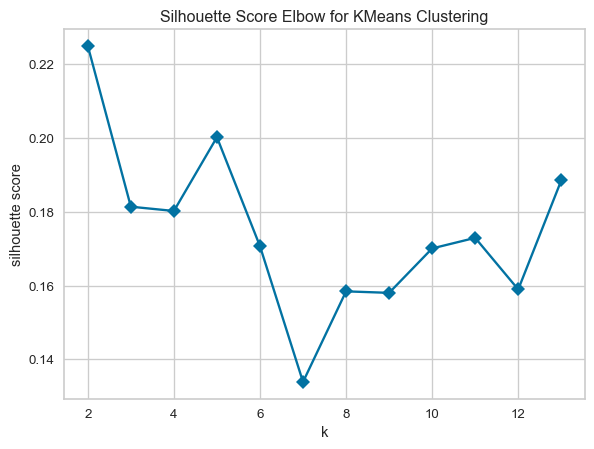
K-Means versus K-Means++
In this section, K-Means is executed using different initialisation methods. In each run, the optimal number of clusters found in the previous section (2) is used. Standard K-Means uses the “random” initialisation, and K-Means++ is activated with the “k-means++” initialisation method. The performance of the algorithms is evaluated using the Sum of Squared Errors (SSE) and the Silhouette coefficient. A comparison of the performance of the algorithms shows that K-Means gave a lower SSE and a higher Silhouette coefficient than K-Means++. However, the difference between the two performance metrics was slight, indicating K-Means was only marginally better than K-Means++.
# Fixed number of clusters derived from the previous question
k = 2

# Run K-Means with random initialisation
kmeans_rand = KMeans(n_clusters=k, init='random', random_state=8, n_init=1)
labels_rand = kmeans_rand.fit_predict(X)

# The inertia is the Sum of Squared Errors (SSE).
sse_rand = kmeans_rand.inertia_

# Calculate Silhouette coefficient
silhouette_rand = silhouette_score(X, labels_rand)

# Run KMeans++ initialization
kmeans_pp = KMeans(n_clusters=k, init='k-means++', random_state=8, n_init=1)
labels_pp = kmeans_pp.fit_predict(X)

# The inertia is the Sum of Squared Errors (SSE).
sse_pp = kmeans_pp.inertia_
silhouette_pp = silhouette_score(X, labels_pp)

# Report results
results = {
    "Random": {"sse": sse_rand, "silhouette_coeff": silhouette_rand},
    "K-Means++": {"sse": sse_pp, "silhouette_coeff": silhouette_pp}
}

# Print results
print(f"{'Initialisation':<10} {'SSE':>5} {'Silhouette Coefficient':>26}")
print("-" * 47)
for method, metrics in results.items():
    sse = f"{metrics['sse']:.2f}"
    silhouette = f"{metrics['silhouette_coeff']:.3f}"
    print(f"{method:<12} {sse:>10} {silhouette:>16}")
Initialisation SSE Silhouette Coefficient
-----------------------------------------------
Random 37341.75 0.225
K-Means++ 37358.70 0.211Next, I repeat K-Means with the random initialisation 50 times and compare the average of the SSE and Silhouette coefficient to the results from the single run of K-Means++. The figure below shows repeated runs of K-Means with random initialisation lead to different values for the metrics from one run to the next. Repeatedly running K-Means results in different random starting points for the cluster centroids, resulting in different clustering outcomes, some better and some worse, but on average, the outcome is similar to a single run of K-Means++.
# Number of repeats
num_runs = 50

# List for metrics
sse_kmean = []
silhouette_kmean = []
runs = []

# Run K-Means 50 times
for i in range(num_runs):
    # Standard K-Means
    kmeans = KMeans(n_clusters=k, init='random', random_state=None, n_init=1)
    labels_kmeans = kmeans.fit_predict(X)
    sse_kmean.append(kmeans.inertia_)
    silhouette_kmean.append(silhouette_score(X, labels_kmeans))
    runs.append(i+1)

# Compute averages
sse_kmean_avg = sum(sse_kmean)/len(sse_kmean)
silhouette_kmean_avg = sum(silhouette_kmean)/len(silhouette_kmean)
fig, ax1 = plt.subplots(figsize=(8, 5))
ax1.plot(runs, sse_kmean, marker="o", linestyle="-", color="b")
ax1.set_xlabel("Run Number")
ax1.set_ylabel("SSE", color="b")
# Create a second y-axis sharing the same x-axis
ax2 = ax1.twinx()
ax2.plot(runs, silhouette_kmean, marker="s", linestyle="--", color="g")
ax2.set_ylabel("Silhouette Coefficient",color="g")
plt.title("K-Means metrics versus Run number")
plt.grid(True)
plt.show()
# Print average results
print("Standard Random Initialisation:")
print(f"Average SSE: {sse_kmean_avg:.2f}")
print(f"Average Silhouette Coefficient: {silhouette_kmean_avg:.3f}")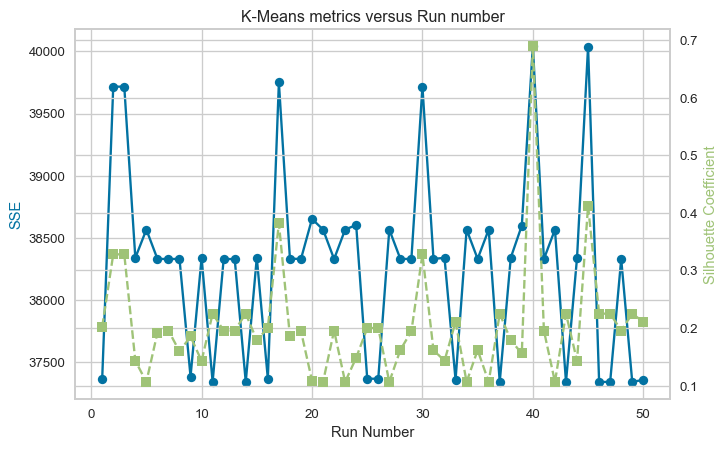
Standard Random Initialisation:
Average SSE: 38288.76
Average Silhouette Coefficient: 0.202
DBSCAN
In this section, DBSCAN is used for clustering the Obesity dataset. The first step is to determine the optimal values for the DBSCAN parameters: “min_samples”, which is the minimum number of points required to form a cluster and “eps”, the maximum distance between two points within the same cluster. From my research, I have deduced the following suggestions:
Minimum Sample
- Generally, min_samples should be greater than or equal to the dimensionality of the data set [1]
- For datasets that have a lot of noise, that are very large, or are high-dimensional, then min_samples should be larger [1].
- If the dataset has more than two dimensions, [2] recommends choosing min_samples = 2*D, where D is the dataset dimension.
eps
- A technique to automatically determine the optimal “eps” value described in [1] is to plot a sorted k-distance graph and find the point of maximum curvature. This point will be the optimal “eps”. The k-distances are the k-nearest-neighbour distances.
References [1] E. Schubert, J. Sander, M. Ester, H. P. Kriegel, and X. Xu, “DBSCAN Revisited, Revisited,” ACM Transactions on Database Systems, vol. 42, no. 3, pp. 1–21, Aug. 2017, doi: https://doi.org/10.1145/3068335.
[2] J. Sander, M. Ester, H.-P. Kriegel, and X. Xu, “Density-Based Clustering in Spatial Databases: The Algorithm GDBSCAN and Its Applications,” Data Mining and Knowledge Discovery, vol. 2, no. 2, pp. 169–194, 1998, doi: https://doi.org/10.1023/a:1009745219419.
from sklearn.neighbors import NearestNeighbors
from kneed import KneeLocator
from sklearn.cluster import DBSCAN
from collections import Counter

def find_eps(data, min_samples):
    """
    Function to calculate the optimum eps value for a given min_samples.

    Calculate the k-nearest-neighbour distances and find the knee
    in the plot.

    :param data: Dataframe containing the data.
    :param min_samples: Number of neighbours.
    :returns: opt_eps and distances_sorted
    """
    # Calculate the average distance between each point in the data and
    # its k nearest neighbours
    neighbours = NearestNeighbors(n_neighbors=min_samples)
    neighbours_fit = neighbours.fit(data)
    distances, indices = neighbours_fit.kneighbors(data)

    # Average distance, excluding self-distance
    avg_distances = np.mean(distances[:, 1:], axis=1)

    distances_sorted = np.sort(avg_distances)

    kneedle = KneeLocator(range(len(distances_sorted)),
                          distances_sorted, curve="convex",
                          direction="increasing")
    opt_eps = distances_sorted[kneedle.knee]
    print(f"Knee eps (k = {min_samples}): {opt_eps:.2f}")

    return opt_eps, distances_sorted

def plot_results(results_dict):
    """
    Function to plot k-distance graph given a dictionary
    containing the distances for each min_samples.
    """
    # Plot
    plt.figure(figsize=(10, 6))

    for key, item in results_dict.items():
        plt.plot(item[1], label=f"k = {key}")

    plt.xlabel("Data Points (sorted)")
    plt.ylabel("Euclidean Distance")
    plt.title("k-NN Distances")
    plt.legend()
    plt.grid(True)
    plt.show()

# Get data
X_dbscan = encoded_ob_scaled

# Empty dictionary to hold results
eps_vs_k = {}

# Consider k=0.5, dim, k=dim and k=2*dim
k_lst =[int(0.5*encoded_ob_df.shape[1]), encoded_ob_df.shape[1], 2*encoded_ob_df.shape[1]]

# Calculate the optimum eps for the list of min_samples
for k in k_lst:
    eps_vs_k[k] = find_eps(X_dbscan, k)

plot_results(eps_vs_k)
Knee eps (k = 10): 4.19
Knee eps (k = 20): 5.16
Knee eps (k = 40): 6.21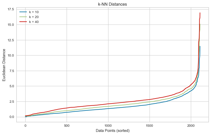
Here, I use the recommendations from my research as the optimum values. i.e. set min_samples = twice the number of dimensions and use the eps value at the knee of the k-distance plot above for the selected min_samples. The result of using these parameters is two clusters.
# DBSCAN using the min_samples = dim and the knee eps for this value
min_samples = 40
opt_eps = eps_vs_k[min_samples][0]

dbscan_model = DBSCAN(eps=opt_eps, min_samples=min_samples,metric='euclidean')

labels_dbscan = dbscan_model.fit_predict(X_dbscan)

score = silhouette_score(X_dbscan, labels_dbscan)

# DBSCAN assigns the label -1 to noise points
# Create a boolean mask to filter out noise points
# Apply mask to predicted labels
# Count the unique labels
num_clusters = len(np.unique(labels_dbscan[labels_dbscan != -1]))

# Number of noise points
num_noise = list(labels_dbscan).count(-1)

print(f"Silhouette score {score:.4f}")
print(f"Number of clusters (excluding noise): {num_clusters}")
print(f"Number of points labeled as noise: {num_noise}")
Silhouette score 0.3786
Number of clusters (excluding noise): 2
Number of points labeled as noise: 66Next, I use a grid search for the optimal parameters over a range of values. The range for eps has an upper bound equal to the highest knee value from the k-distance plot, and for min_samples, the range is from 5 to 2 times the number of dimensions. The grid search aims to maximise the Silhouette coefficient. The minimum number of clusters allowed in the search is two, to be consistent with the approach to finding the optimal number of clusters using K-Means.
from sklearn.metrics import calinski_harabasz_score
# The code in this cell was inspired by Oscar Wu's week 4 tutorial notebook.

# Here I use the rules from my research to bound the grid search.
# Set the eps range to test upper bound set to the highest knee value found above
eps_values = np.arange(0.5, eps_vs_k[k_lst[-1]][0]+0.1, 0.1)

#Set the min_samples to test bounded 5 to 2*dim
min_samples_values = np.arange(5, k_lst[-1]+1, 1)

def evaluate_clustering(X, eps, min_samples, method="Silhouette", min_clusters=1):
    dbscan = DBSCAN(eps=eps, min_samples=min_samples)
    labels_pred = dbscan.fit_predict(X)

    # Nmber of cluster excluding noise
    n_clusters = len(np.unique(labels_pred[labels_pred != -1]))

    if n_clusters < min_clusters:
        return -1, n_clusters

    if method == "Silhouette":
        # Use silhouette score
        score = silhouette_score(X, labels_pred)
    elif method == "Calinski-Harabasz":
        # Use Calinski-Harabasz score
        score = calinski_harabasz_score(X, labels_pred)
    else:
        raise(f"Method {method} not supported!")

    return score, n_clusters

results_sil = []
for eps in eps_values:
    for min_samples in min_samples_values:
        method = "Silhouette"
        score, n_clusters = evaluate_clustering(X_dbscan, eps, min_samples, method=method, min_clusters=2)
        results_sil.append({"method": method, "eps": eps, "min_samples": min_samples,
                             "n_clusters": n_clusters, "score": score, })

# Convert results to DataFrame and sort by silhouette score
results_sil_df = pd.DataFrame(results_sil)
top_results_sil = results_sil_df.sort_values(by="score", ascending=False).head(5).to_string(index=False)

print("Top 5 DBSCAN parameter combinations by Silhouette score:")
print(top_results_sil)
Top 5 DBSCAN parameter combinations by Silhouette score:
method eps min_samples n_clusters score
Silhouette 6.3 5 5 0.395805
Silhouette 6.2 5 5 0.395805
Silhouette 6.3 6 5 0.395805
Silhouette 6.0 5 5 0.395260
Silhouette 6.1 5 5 0.395260Using the Silhouette score as a metric in the grid search reveals that the top 5 scores DBSCAN produces are for five clusters, compared to the two made by K-Means or DBSCAN using the optimal settings based on the literature. The Silhouette score for the five clusters is higher than the score for the K-Means two clusters.
The Calinski-Harabasz score measures the ratio of between-cluster variance to within-cluster variance. It ignores noise by only considering cluster members and works better with irregular cluster shapes. The higher the score, the better the clustering. Next, I tried finding the optimal eps and min_samples using a grid search to maximise the Calinski-Harabasz score.
results_chi = []
for eps in eps_values:
    for min_samples in min_samples_values:
        method = "Calinski-Harabasz"
        score, n_clusters = evaluate_clustering(X_dbscan, eps, min_samples, method=method, min_clusters=2)
        results_chi.append({"method": method, "eps": eps, "min_samples": min_samples,
                             "n_clusters": n_clusters, "score": score, })

# Convert results to DataFrame and sort by score
results_chi_df = pd.DataFrame(results_chi)
top_results_chi = results_chi_df.sort_values(by="score", ascending=False).head(5).to_string(index=False)

print("Top 5 DBSCAN parameter combinations by Calinski-Harabasz score:")
print(top_results_chi)
Top 5 DBSCAN parameter combinations by Calinski-Harabasz score:
method eps min_samples n_clusters score
Calinski-Harabasz 3.3 39 2 201.775071
Calinski-Harabasz 3.3 27 2 201.440799
Calinski-Harabasz 3.3 26 2 201.440799
Calinski-Harabasz 3.3 40 2 201.347066
Calinski-Harabasz 3.3 37 2 201.082630Using the Calinski-Harabasz score as a metric, the number of clusters found is two.
When finding the optimal values for the DBSCAN parameters eps and min_samples, maximising the Silhouette score may not be the ideal approach. The Silhouette score tends to favour fewer, well-separate spherical clusters. It penalises overlapping or close clusters and can be misleading when noise points are present. For this dataset, maximising the Silhouette score in DBSCAN leads to one cluster, unless the number of clusters is limited to two in the grid search. Then five clusters are found. Maximising the Calinski-Harabasz score or setting the values of eps and min_samples using published recommendations results in two clusters being identified.
Part 2 - Gene expression dataset
Data
The dataset used in this part is the [gene expression cancer RNA-Seq] (https://archive.ics.uci.edu/dataset/401/gene+expression+cancer+rna+seq) from the UC Irvine Machine Learning Repository. The data is licensed under CC BY, allowing it to be freely used for this exercise. This dataset contains gene expression of patients with different types of tumours. The data comprises 20531 features. Labels for each row in the dataset are included in a separate CSV file.
Load data
The data is loaded into a pandas dataframe from the downloaded CSV file. After loading the data, the shape of the dataframe is printed. The dataframe is then checked for any missing values. This dataset is clean with no missing values.
Load data
# Load the data file into a dataframe
gene_df = pd.read_csv("gene_data.csv", comment="#")

# Print the shape of the dataframe
print(f"Dataframe contains {gene_df.shape[0]} rows and {gene_df.shape[1]} columns.")

# Check how many null values in the data frame
print()
print("Feature Name  Number of missing entries")
print(gene_df.isnull().sum())
Dataframe contains 801 rows and 20532 columns.
Feature Name Number of missing entries
Unnamed: 0 0
gene_0 0
gene_1 0
gene_2 0
gene_3 0
..
gene_20526 0
gene_20527 0
gene_20528 0
gene_20529 0
gene_20530 0
Length: 20532, dtype: int64PCA
Principal component analysis (PCA) was performed to reduce the dimensionality of the data. In this example, it was requested to return the first three principal components. PCA creates uncorrelated features in the reduced-dimensional space, onto which the original data is projected. The data projected onto the first three principal components is shown in the 3D scatter plot below.
from sklearn.preprocessing import StandardScaler
from sklearn.decomposition import PCA

# Create SciKitlearn StandardScaler
sclr_standard = StandardScaler()

# Copy the data before normalisation
data_norm_df = gene_df.copy()

# Select only numeric columns
numeric_cols = data_norm_df.select_dtypes(include='number').columns

# Apply SciKitlearn StandardScaler
data_norm_df[numeric_cols] = sclr_standard.fit_transform(data_norm_df[numeric_cols])

# Number of princiapl components to extract
n_components = 3

# Generate the first n principal components
pca = PCA(n_components=n_components)

# Do the PCA on the data and transform it into the principal directions
princ_cmpts = pca.fit_transform(data_norm_df.iloc[:,1:])
fig = plt.figure(figsize=(10, 10))
ax = fig.add_subplot(111, projection='3d')
ax.scatter(princ_cmpts[:,0], princ_cmpts[:,1], princ_cmpts[:,2],
marker='o', alpha=0.5, label='Projected Data', color='b'
)
# Label axes for the plot
ax.set_xlabel('Principal Component 1')
ax.set_ylabel('Principal Component 2')
ax.set_zlabel('Principal Component 3')
plt.title('3D Scatter Plot of projected data')
plt.show()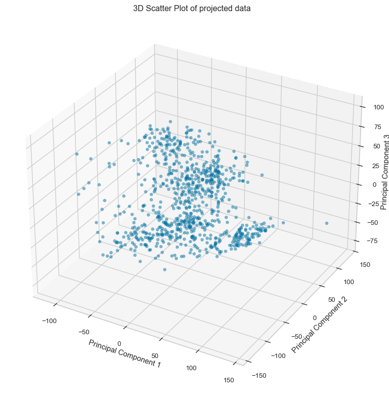
Variance covered by the principal components
The variance of each principal component is calculated as the ratio of its eigenvalue to the sum of all eigenvalues of the data. The cumulative graph shows that approximately 27% of the variance in the data is covered by the first three principal components. The first component contributes approximately 10.5%, the second principal component approximately 8.7%, and finally the third principal component approximately 7.8% of the variation in the data.
# Explained variance ratio
explained_variance_ratio = pca.explained_variance_ratio_

# Cumulative sum of the variance explained by the principal components
cumulative_variance = np.cumsum(explained_variance_ratio)
print(f"The variance explained by the first {n_components} is {cumulative_variance[-1]*100:.2f} (%).")

# Plotting
plt.figure(figsize=(10, 6))
plt.bar(range(1, len(explained_variance_ratio) + 1), explained_variance_ratio, alpha=0.6, label='Individual Explained Variance')
plt.plot(range(1, len(cumulative_variance) + 1), cumulative_variance, marker='o', color='red', label='Cumulative Explained Variance')
plt.xlabel('Principal Component')
plt.ylabel('Explained Variance Ratio')
plt.title('Explained Variance Ratio by Principal Components')
plt.legend()
plt.grid(True)
plt.tight_layout()
plt.show()
The variance explained by the first 3 is 27.10 (%).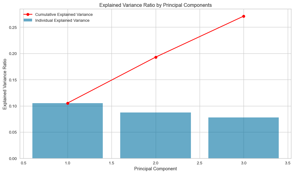
K-Means
In this section, the performance of K-Means clustering applied to two versions of the dataset is compared: 1. The original standardised dataset. 2. The transformed dataset using PCA, retaining the top 3 principal components.
The quality of clustering is evaluated using Purity, Normalised Mutual Information Score, and Silhouette Score, to determine whether PCA improves the clustering results.
- Cluster Labels:
The original standardised dataset and the PCA-transformed dataset produce different clusters with differing majority class labels:
- Original standardised data: {0: ‘LUAD’, 1: ‘BRCA’, 2: ‘KIRC’, 3: ‘PRAD’, 4: ‘COAD’}
- PCA projected data: {0: ‘LUAD’, 1: ‘PRAD’, 2: ‘BRCA’, 3: ‘KIRC’}
This indicates that PCA did not preserve the underlying cluster structure from the original data.
- Purity Scores:
- Purity with the original standardised data: 92.01%
- Purity with the PCA projected data: 76.15%
- The difference suggests that PCA significantly deteriorates the cluster-to-class alignment.
- Normalised Mutual Information Scores (NMI):
- Original standardised dataset: 0.85
- PCA projected data: 0.647
- PCA decreased the alignment of clusters with ground truth labels, as seen in the lower Normalised Mutual Information Score.
- Silhouette Scores:
- Original dataset: 0.135
- PCA projected data: 0.426
- Silhouette Scores are nearly identical, showing that PCA did not significantly improve cluster cohesion or separation.
The cluster using the original standardised dataset has clusters that match the true labels well (high MI), but those clusters are less compact or overlapping (low Silhouette). Conversely, the clusters produced for the PCA projected dataset have geometrically well-separated clusters (high Silhouette), but they don’t align as well with the true labels (low MI). The PCA projected dataset explained 27% of the variation in the original standardised dataset, as clearly shown in the different K-Means clustering.
# Create subplots
fig, axes = plt.subplots(1, 2, figsize=(12, 5))

# First visualizer for original data
model_1 = KMeans(random_state=10)
visualizer_1 = KElbowVisualizer(model_1, k=(2,10), ax=axes[0], timings=False, locate_elbow=True)
visualizer_1.fit(data_norm_df.iloc[:,1:])
visualizer_1.finalize()

# Second visualizer for PCA transformed data
model_2 = KMeans(random_state=10)
visualizer_2 = KElbowVisualizer(model_2, k=(2,10), ax=axes[1], timings=False, locate_elbow=True)
visualizer_2.fit(princ_cmpts)
visualizer_2.finalize()

# Access the optimal k value
optimal_k_orig = visualizer_1.elbow_value_
optimal_k_pca_data = visualizer_2.elbow_value_

print(f"Optimal number of clusters for original standardised data: {optimal_k_orig}")
print(f"Optimal number of clusters for PCA projected data: {optimal_k_pca_data}")

axes[0].set_title("Disortion Score Elbow for K-Means of Original standardised data")
axes[1].set_title("Disortion Score Elbow for K-Means of PCA projected data")

plt.tight_layout()
plt.show()
Optimal number of clusters for original standardised data: 5
Optimal number of clusters for PCA projected data: 4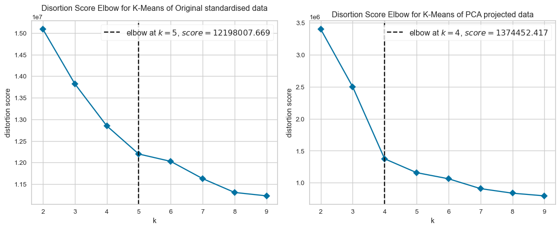
from collections import Counter
from sklearn.metrics import normalized_mutual_info_score

# Load the labels file into a dataframe
labels_df = pd.read_csv("gene_labels.csv", comment="#")

# Print the shape of the dataframe
print(f"Dataframe contains {labels_df.shape[0]} rows and {labels_df.shape[1]} columns.")
print()

# Isolate the labels as ground_truth
ground_truth = labels_df["Class"]
unique_labels = ground_truth.unique()
print(f"There are {len(unique_labels)} unique labels, {unique_labels}")
print()

# Use optimal values to create K-Means clustering for the original and PCA projected data
kmean_orig = KMeans(optimal_k_orig, random_state=10)
predict_orig = kmean_orig.fit_predict(data_norm_df.iloc[:,1:])

kmean_pca_data = KMeans(optimal_k_pca_data, random_state=10)
predict_pca_data = kmean_pca_data.fit_predict(princ_cmpts)

def map_predicted_to_ground_thruth(k, true_labels, predicted_label):
    """
    Function to map each predicted cluster ID to the most common ground
    truth label within that cluster and count the number of correct labels
    in each cluster

    :param k: Number of clusters
    :param true_labels: Ground truth labels
    :predicted_label: Predicted class
    :return: Dictionary containing the mapping between true label and cluster id,
        and a list of the number of occurrences of the most common label in each cluster.
    """
    labelled_clusters = {}
    correct_counts = []

    for cluster_id in range(k):
        # Get ground truth labels for samples in this cluster
        labels_in_cluster = true_labels[predicted_label == cluster_id]

        # Count occurrences of each label
        label_counts = Counter(labels_in_cluster)

        # Find the most common label
        most_common_label = label_counts.most_common(1)[0][0]

        # Assign to dictionary
        labelled_clusters[cluster_id] = most_common_label

        # Get the number of samples with the most common label
        most_common_count = max(label_counts.values())

        # Append the count
        correct_counts.append(most_common_count)

    return labelled_clusters, correct_counts

# Create a dictionary to map each cluster to its most common ground truth label
labelled_clusters_orig, correct_counts_orig  = map_predicted_to_ground_thruth(optimal_k_orig, ground_truth, predict_orig)
labelled_clusters_pca, correct_counts_pca = map_predicted_to_ground_thruth(optimal_k_pca_data, ground_truth, predict_pca_data)

print(f"Majority cluster ID verus class labels:")
print(f"    original standardised data: {labelled_clusters_orig}")
print(f"    PCA projected data: {labelled_clusters_pca}")

# Purity
purity_orig = np.sum(correct_counts_orig) / len(ground_truth)
purity_pca_data = np.sum(correct_counts_pca) / len(ground_truth)

# Mutual Information Score
mi_score_orig = normalized_mutual_info_score(ground_truth, predict_orig)
mi_score_pca_data = normalized_mutual_info_score(ground_truth, predict_pca_data)

# Silhouette coefficient
silhouette_orig = silhouette_score(data_norm_df.iloc[:,1:], predict_orig)
silhouette_pca_data = silhouette_score(princ_cmpts, predict_pca_data)
Dataframe contains 801 rows and 2 columns.
There are 5 unique labels, ['PRAD' 'LUAD' 'BRCA' 'KIRC' 'COAD']
Majority cluster ID verus class labels:
original standardised data: {0: 'LUAD', 1: 'BRCA', 2: 'KIRC', 3: 'PRAD', 4: 'COAD'}
PCA projected data: {0: 'LUAD', 1: 'PRAD', 2: 'BRCA', 3: 'KIRC'}# Report results
results = {
"Original standardised": {"purity": purity_orig, "mi":mi_score_orig, "silhouette_coeff": silhouette_orig},
"PCA projected": {"purity": purity_pca_data, "mi":mi_score_pca_data, "silhouette_coeff": silhouette_pca_data}
}
# Print results
print(f"{'Data':<23} {'Purity (%)':>6} {'Mutual Information':>20} {'Silhouette Coefficient':>24}")
print("-" * 80)
for method, metrics in results.items():
purity = f"{metrics['purity']*100:.2f}"
mi = f"{metrics['mi']:.3f}"
silhouette = f"{metrics['silhouette_coeff']:.3f}"
print(f"{method:<23} {purity:>5} {mi:>13} {silhouette:>20}")Data Purity (%) Mutual Information Silhouette Coefficient
--------------------------------------------------------------------------------
Original standardised 92.01 0.850 0.135
PCA projected 76.15 0.647 0.426