description = 'Darrin William Stephens, SIT741: Statistical Data Analysis, Task T05.P5'EDA and Linear Regression
Introduction
In this task, has two parts. The first part involves building a linear and generalised linear model for some features from a dataset on abalone from https://archive.ics.uci.edu/dataset/1/abalone. The second part involves the use of exploratory data analysis on a second dataset.
Part 1 Task steps
1. Define a string and print it
This section defines a string containing my name, the unit name and the task name.
Print the string using the cat() function.
cat(description)Darrin William Stephens, SIT741: Statistical Data Analysis, Task T05.P52. Read the data
Read the data and rename columns to have appropriate labels.
abalone = read.table("http://archive.ics.uci.edu/ml/machine-learning-databases/abalone/abalone.data", sep = ",")

# Rename columns
abalone_df = abalone |>
  rename(
    sex=V1,
    length=V2,
    diameter=V3,
    height=V4,
    whole_weight=V5,
    shucked_weight=V6,
    viscera_weight=V7,
    shell_weight=V8,
    rings=V9
  )

glimpse(abalone_df)
Rows: 4,177
Columns: 9
$ sex <chr> "M", "M", "F", "M", "I", "I", "F", "F", "M", "F", "F", …
$ length <dbl> 0.455, 0.350, 0.530, 0.440, 0.330, 0.425, 0.530, 0.545,…
$ diameter <dbl> 0.365, 0.265, 0.420, 0.365, 0.255, 0.300, 0.415, 0.425,…
$ height <dbl> 0.095, 0.090, 0.135, 0.125, 0.080, 0.095, 0.150, 0.125,…
$ whole_weight <dbl> 0.5140, 0.2255, 0.6770, 0.5160, 0.2050, 0.3515, 0.7775,…
$ shucked_weight <dbl> 0.2245, 0.0995, 0.2565, 0.2155, 0.0895, 0.1410, 0.2370,…
$ viscera_weight <dbl> 0.1010, 0.0485, 0.1415, 0.1140, 0.0395, 0.0775, 0.1415,…
$ shell_weight <dbl> 0.150, 0.070, 0.210, 0.155, 0.055, 0.120, 0.330, 0.260,…
$ rings <int> 15, 7, 9, 10, 7, 8, 20, 16, 9, 19, 14, 10, 11, 10, 10, …3. Build a linear model
I am required to build a linear model that predicts the age using any two of the numeric variables (“length”, “diameter”, “height”,“whole_weight”, “shucked_weight”,“viscera_weight”,“shell_weight”). Here, I have chose to use “diameter” and “shell_weight”.
Firstly, I’ll convert the “rings” into the “age” as suggested by the dataset source.
# Convert "rings" to "age" by adding 1.5 (as per dataset documentation)
abalone_df = abalone_df |>
  mutate(
    age=rings + 1.5,
    )
Scatter plots of Age versus the chosen independent variables
Let’s look at scatter plots of these independent variables against the dependent variable.
abalone_df |>
  ggplot(aes(x=diameter, y=age)) +
  geom_point(alpha=0.5) +
  labs(title="Age vs Diameter", x="Diameter (mm)", y="Age (years)", ) +
  theme(plot.title=element_text(hjust=0.5))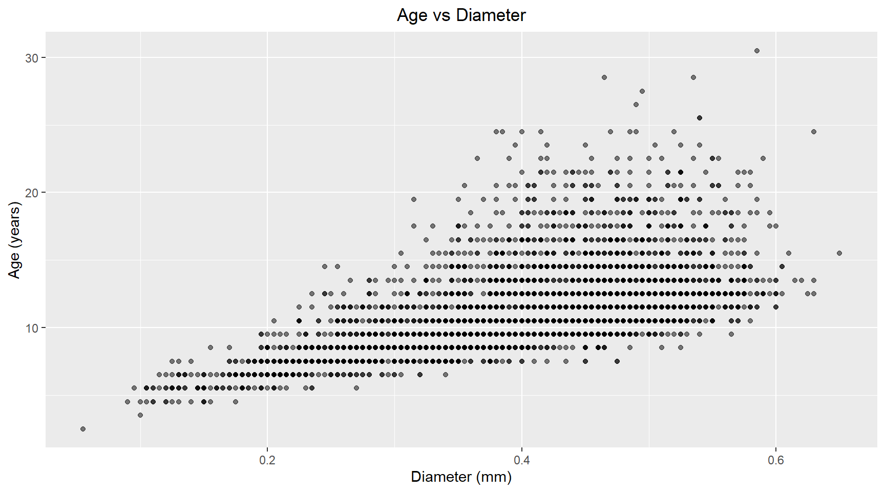
abalone_df |>
  ggplot(aes(x=shell_weight, y=age)) +
  geom_point(alpha=0.5) +
  labs(title="Age vs Shell Weight", x="Shell Weight (grams)", y="Age (years)") +
  theme(plot.title=element_text(hjust=0.5))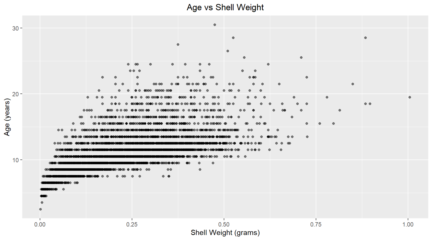
Linear model
Now I build a linear model of age versus diameter and shell weight for abalone. The model coefficients are shown below.
library(broom)

# Build linear model
model = lm(age ~ diameter + shell_weight , data=abalone_df)

model_results = augment(model)

# Print coefficients
tidy(model)
# A tibble: 3 × 5
term estimate std.error statistic p.value
<chr> <dbl> <dbl> <dbl> <dbl>
1 (Intercept) 7.67 0.246 31.1 1.79e-191
2 diameter 1.17 0.922 1.27 2.04e- 1
3 shell_weight 13.8 0.657 21.0 6.24e- 93The coefficient p-values indicate that the diameter isn’t significant. Possible because the shell weight is capturing most of the size-realte variance.
4. Check Q-Q Plot and residuals
Q-Q Plot
The Q-Q plot shown below reveals that most of the points in the middle region are close the the reference line. This suggests that the residuals are approximately normally distributed. There is some minor deviation at the lower quantiles and moderate deviation at the upper quantiles. This could indicate slight non-normality in the extreme values and possible outliers.
model_results |>
  ggplot(aes(sample=.std.resid)) +
  geom_qq() +
  geom_qq_line(col="steelblue") +
  ggtitle("QQ Plot of Residuals") +
  theme(plot.title=element_text(hjust=0.5))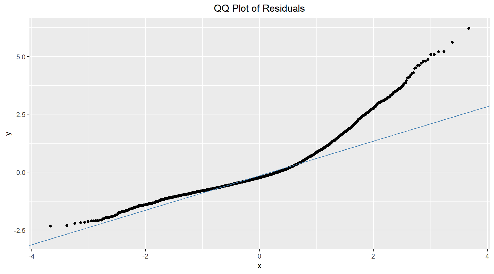
Residual plots
Residuals vs Fitted
# Residuals vs Fitted
model_results |>
  ggplot(aes(.fitted, .resid)) +
  geom_point(alpha=0.5) +
  geom_hline(yintercept=0, color="red", linetype="dashed") +
  geom_quantile() +
  geom_smooth(colour="firebrick") +
  labs(title="Residuals vs Fitted", x="Fitted Values", y="Residuals") +
  theme(plot.title=element_text(hjust=0.5))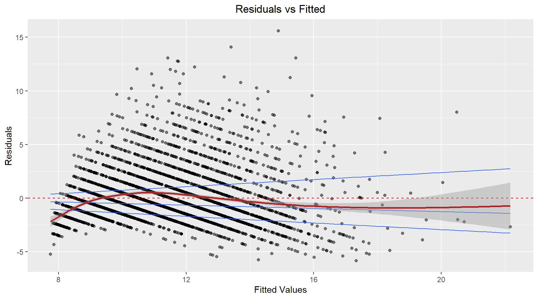
The residuals appear to fan-out (spread) as the fitted value increases. This suggest that the variance is not constant. The model’s prediction accuracy will vary across the range of predicted values with less reiable predictions for higher fitted values.
Residuals vs Diameter
# Residuals vs Fitted
model_results |>
  ggplot(aes(abalone_df$diameter, .resid)) +
  geom_point(alpha=0.5) +
  geom_hline(yintercept=0, color="red", linetype="dashed") +
  geom_quantile() +
  geom_smooth(colour="firebrick") +
  labs(title="Residuals vs Diameter", x="Diameter", y="Residuals") +
  theme(plot.title=element_text(hjust=0.5))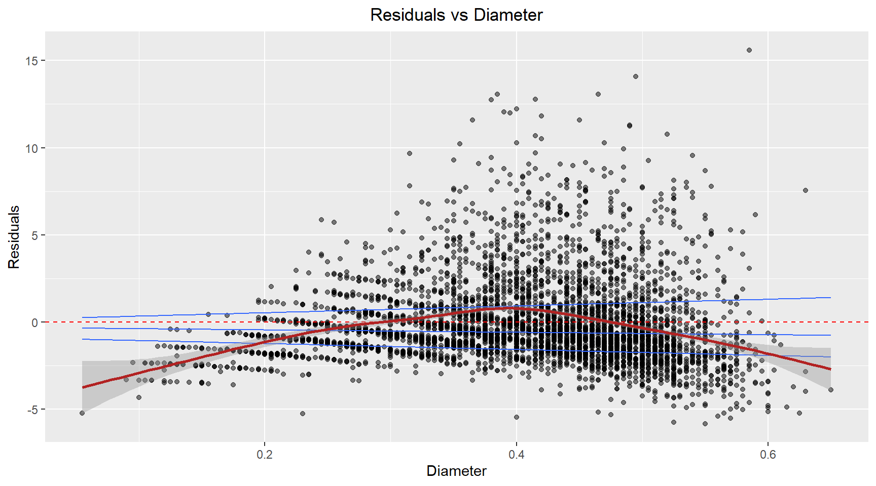
The residuals exhibit a curved, non-linear relationship. This suggests the relationship between the diameter and age isn’t captured well by a linear term.
Residuals vs ShellWeight
model_results |>
ggplot(aes(abalone_df$shell_weight, .resid)) +
  geom_point(alpha=0.5) +
  geom_hline(yintercept=0, color="red", linetype="dashed") +
  geom_quantile() +
  geom_smooth(colour="firebrick") +
  labs(title="Residuals vs ShellWeight", x="ShellWeight", y="Residuals") +
  theme(plot.title=element_text(hjust=0.5))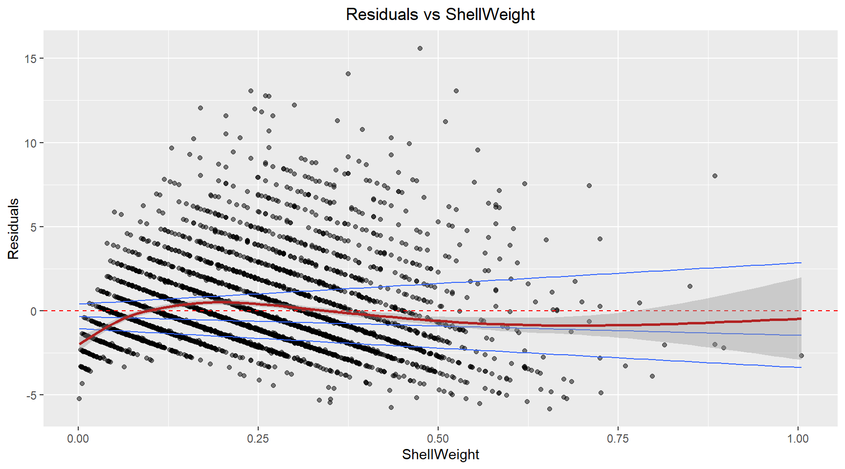
A similar pattern to the fitted plot, suggesting that the non-constant variance in the model is likely caused by the Shell weight.
Influence plot
Here I plot the standardised residuals against .hat to allow identification of high leverage, high influence and outlier points.
# Influence plot
model_results |>
ggplot(aes(x=.hat, y=.std.resid)) +
  geom_point(alpha=0.5) +
  geom_hline(yintercept=0, color="red", linetype="dashed") +
  labs(title="Residuals vs .hat", x=".hat", y="Residuals") +
  theme(plot.title=element_text(hjust=0.5))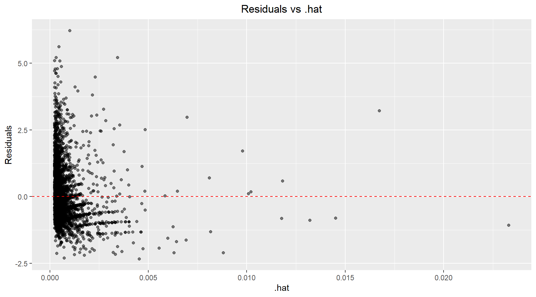
There are a handful of points with high leverage (.hat > 0.01) and several points with residuals above 3 that could be classified as outliers. Next, I plot the Cook’s distance versus .hat and mark points with a .hat value above 0.01. Using the 4/n rule, the calculated threshold was 4/4177 ≈ 0.001. However, I chose to use a more conservative threshold of 0.01 (the next order of magnitude) to focus my analysis on the most highly influential observations and reduce the number of points requiring detailed investigation. Scatter plots of the Age versus Diamter and Age versus Shell Weight are shown below with the influential points highlighted.
model_results |>
  mutate(big_hat=.hat > 0.01) |>
  ggplot(aes(x=.hat, y=.cooksd)) +
  geom_point(aes(color=big_hat)) +
  geom_hline(yintercept=0, color="red", linetype="dashed") +
  labs(title="Cook's distance vs .hat", x=".hat", y="Residuals") +
  theme(plot.title=element_text(hjust=0.5))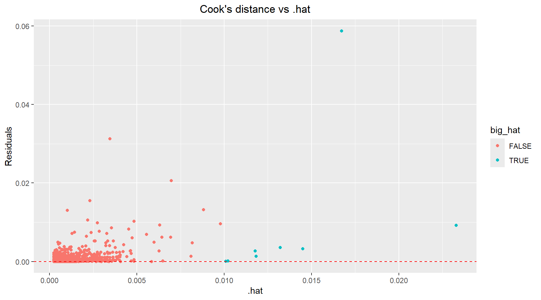
# Identify influential points
data_with_diagnostics=model_results |>
  mutate(influence_level=ifelse(.cooksd > 0.01, "High", "Low"))

data_with_diagnostics |>
  ggplot(aes(x=diameter, y=age, colour=influence_level)) +
  geom_point(alpha=0.6) +
  scale_color_manual(values=c("Low"="darkgrey", "High"="red")) +
  labs(title="Age vs Diameter with Influential Points Highlighted", x="Diameter (mm)", y="Age (years)") +
  theme(plot.title=element_text(hjust=0.5))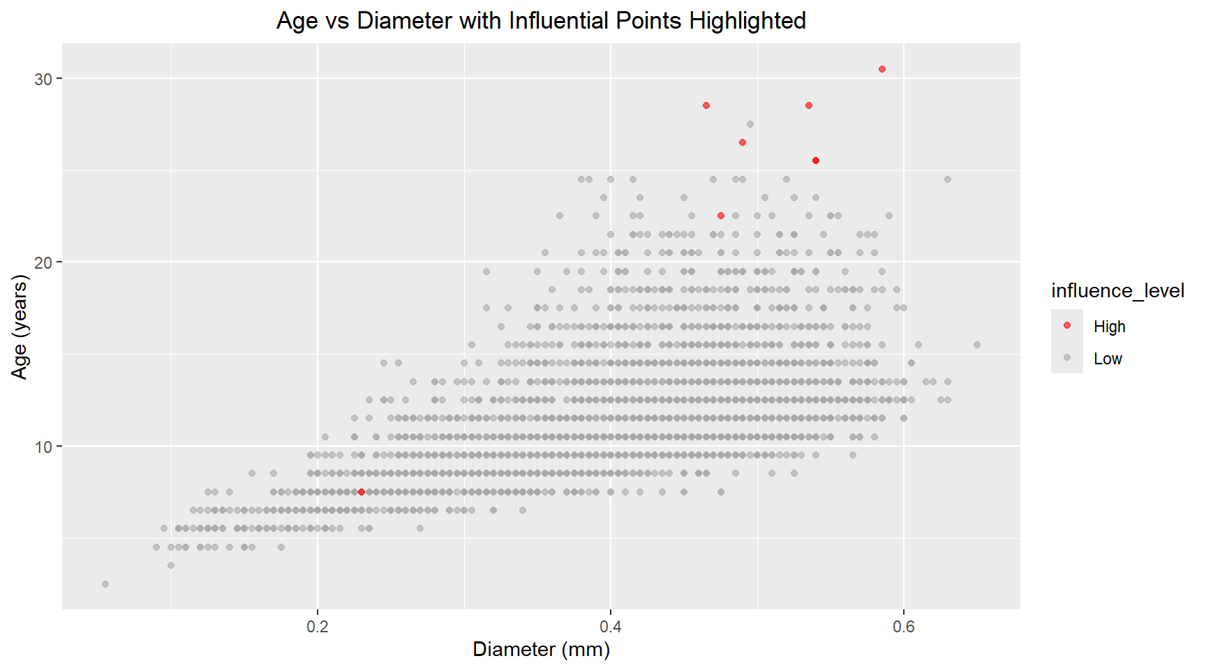
data_with_diagnostics |>
  ggplot(aes(x=shell_weight, y=age, colour=influence_level)) +
  geom_point(alpha=0.6) +
  scale_color_manual(values=c("Low"="darkgrey", "High"="red")) +
  labs(title="Age vs Shell Weight with Influential Points Highlighted", x="Shell weight (grams)", y="Age (years)") +
  theme(plot.title=element_text(hjust=0.5))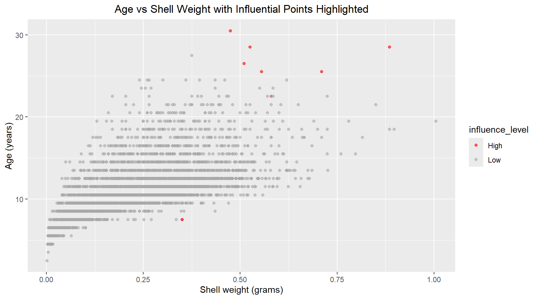
# Print summary statistics
glance(model)
# A tibble: 1 × 12
r.squared adj.r.squared sigma statistic p.value df logLik AIC BIC
<dbl> <dbl> <dbl> <dbl> <dbl> <dbl> <dbl> <dbl> <dbl>
1 0.394 0.394 2.51 1357. 0 2 -9770. 19548. 19573.
# ℹ 3 more variables: deviance <dbl>, df.residual <int>, nobs <int>The \(R^2\) value of the model is very low, suggesting a weak linear relationship between Age, Shell Weight and Diameter.
5. Generalised linear model
I now create a generalised linear model for Age versus daimeter, shell_weight and length.
abalone_df |>
  ggplot(aes(x=age)) +
  geom_bar(color="darkgray") +
  labs(title="Distribution of Age", x="Age (years)", y="Count") +
  theme(plot.title=element_text(hjust=0.5))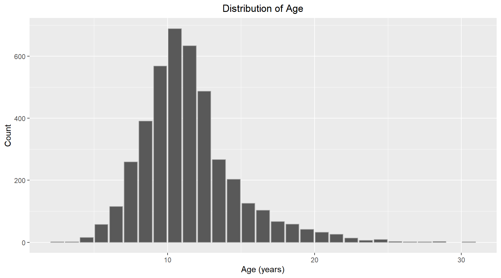
The distribution of Age looks normal with some positive skew. I will use Gaussian for the family and “identity” for the link function. I have chosen to add length as an additional parameter to the model.
# Fit the model
glm_model = glm(formula=age ~ diameter + shell_weight + length, family=gaussian(link="identity"), data=abalone_df)

glm_model_results = augment(glm_model)

# Print coefficients
tidy(glm_model)
# A tibble: 4 × 5
term estimate std.error statistic p.value
<chr> <dbl> <dbl> <dbl> <dbl>
1 (Intercept) 8.23 0.259 31.7 2.43e-198
2 diameter 16.7 2.50 6.68 2.71e- 11
3 shell_weight 14.1 0.655 21.5 5.48e- 97
4 length -13.3 1.99 -6.68 2.76e- 11The p-values for the model coefficients now show that each variable is now significant.Each variable is explaining unique variance that the others don’t capture. Inspecting the correlation between each of the three features, shows that they are highly correlated with each other. This multicollinearity resulted in the diameter not being a significant predictor in the linear model.
              diameter    length shell_weight
diameter     1.0000000 0.9868116    0.9053298
length       0.9868116 1.0000000    0.8977056
shell_weight 0.9053298 0.8977056    1.0000000
The summary statistics for the generalised linear model are shown below.
# Print summary statistics
glance(glm_model)
# A tibble: 1 × 8
null.deviance df.null logLik AIC BIC deviance df.residual nobs
<dbl> <int> <dbl> <dbl> <dbl> <dbl> <int> <int>
1 43411. 4176 -9748. 19506. 19537. 26025. 4173 4177The pseudo R-squared is calculated as
R_squared_glm = 1 - (glm_model$deviance / glm_model$null.deviance)

cat(R_squared_glm)0.400488The 3-predictor generalised linear model showed improved fit over the 2-predictor linear model. Deviance decreased from 26303.23 to 26025.19, and AIC improved from 19547.9 to 19505.52, indicating better model fit despite the added complexity. The pseudo R-squared increased from 0.39 to 0.40. All three predictors became statistically significant (p < 0.001) in the full model, suggesting that length captures unique variation in age not explained by diameter and shell weight alone.”
Part 2 Task steps
This section uses data from https://data.gov.au/data/dataset/emergency-department-admissisons-and-attendances.
6. Load dataset
heda = read.csv("https://data.gov.au/data/dataset/6bfec5ea-207e-4d67-8965-c7e72290844b/resource/33d84954-b13a-4f4e-afb9-6468e287fa3c/download/govhack3.csv") # Look at the structure to understand column names
head(heda) X Royal.Perth.Hospital X.1 X.2 X.3 X.4 X.5 X.6
1 Date Attendance Admissions Tri_1 Tri_2 Tri_3 Tri_4 Tri_5
2 01-JUL-2013 235 99 8 33 89 85 20
3 02-JUL-2013 209 97 N/A 41 73 80 14
4 03-JUL-2013 204 84 7 40 72 79 6
5 04-JUL-2013 199 106 3 37 73 70 15
6 05-JUL-2013 193 96 4 40 76 62 11
Fremantle.Hospital X.7 X.8 X.9 X.10 X.11 X.12
1 Attendance Admissions Tri_1 Tri_2 Tri_3 Tri_4 Tri_5
2 155 70 N/A 25 67 54 9
3 145 56 N/A 22 51 47 24
4 118 60 N/A 24 37 43 12
5 125 61 N/A 21 47 42 14
6 136 58 4 23 51 45 13
Princess.Margaret.Hospital.For.Children X.13 X.14 X.15 X.16 X.17
1 Attendance Admissions Tri_1 Tri_2 Tri_3 Tri_4
2 252 59 N/A 13 75 159
3 219 47 N/A 14 61 139
4 186 31 N/A 11 53 120
5 192 41 N/A 8 57 126
6 201 42 N/A 14 53 130
X.18 King.Edward.Memorial.Hospital.For.Women X.19 X.20 X.21 X.22
1 Tri_5 Attendance Admissions Tri_1 Tri_2 Tri_3
2 4 52 6 N/A N/A 7
3 4 43 7 N/A N/A N/A
4 N/A 55 5 N/A N/A 4
5 N/A 42 6 N/A N/A 7
6 N/A 64 3 N/A N/A 5
X.23 X.24 Sir.Charles.Gairdner.Hospital X.25 X.26 X.27 X.28 X.29
1 Tri_4 Tri_5 Attendance Admissions Tri_1 Tri_2 Tri_3 Tri_4
2 20 25 209 109 N/A 42 108 47
3 25 17 184 112 N/A 43 73 61
4 23 28 171 102 N/A 49 69 48
5 21 14 153 89 6 35 57 46
6 36 22 167 117 7 39 70 46
X.30 Armadale.Kelmscott.District.Memorial.Hospital X.31 X.32 X.33
1 Tri_5 Attendance Admissions Tri_1 Tri_2
2 11 166 19 N/A 16
3 5 175 25 N/A 26
4 3 145 11 N/A 19
5 9 144 15 N/A 15
6 5 147 18 N/A 17
X.34 X.35 X.36 Swan.District.Hospital X.37 X.38 X.39 X.40 X.41
1 Tri_3 Tri_4 Tri_5 Attendance Admissions Tri_1 Tri_2 Tri_3 Tri_4
2 62 79 9 133 17 N/A 29 59 42
3 73 55 19 129 25 N/A 25 57 43
4 62 60 4 126 7 3 24 42 55
5 48 69 12 108 19 N/A 14 45 43
6 59 63 7 122 24 3 15 61 37
X.42 Rockingham.General.Hospital X.43 X.44 X.45 X.46 X.47 X.48
1 Tri_5 Attendance Admissions Tri_1 Tri_2 Tri_3 Tri_4 Tri_5
2 N/A 155 10 N/A 12 51 81 11
3 4 145 24 N/A 26 45 65 8
4 N/A 151 14 N/A 10 50 87 3
5 6 129 15 N/A 24 45 55 4
6 6 122 12 N/A 19 46 53 4
Joondalup.Health.Campus X.49 X.50 X.51 X.52 X.53
1 Attendance Admissions Tri_1 Tri_2 Tri_3 Tri_4
2 267 73 N/A 27 75 151
3 241 81 N/A 23 78 133
4 213 67 N/A 29 66 99
5 227 72 5 26 68 117
6 229 71 N/A 37 80 106
X.54
1 Tri_5
2 12
3 7
4 17
5 11
6 4 7. Plot of attendance and admissions over time
Clean the data header structure
From the head of the dataframe it can be seen that the CSV file had two rows for the header. The first row contains the hospital names and the 2nd row contains the variable names. I will gather the hospital names into a list. Apart from the first variable, which is date, the remaining variable names repeat for each hospital. I will create new column names using the hospital names and the variable names, that way each variable name will be unique. I can then remove the first row and rename the columns using my new names.
# Specify column numbers that contain hospital names
column_numbers = c(2, 9, 16, 23, 30, 37, 44, 51, 58)

# Get column names
hospital_names = names(heda)[column_numbers]

col_names = c("date")
for(hospital in hospital_names) {
  col_names = c(col_names, paste0(hospital, c("_Attendance", "_Admissions", "_Tri1", "_Tri2", "_Tri3", "_Tri4", "_Tri5")))
}

heda_clean = heda |>
  slice(-1) |> # Remove the first row
  setNames(col_names)
Convert the Date and other columns to appropriate datatype
The dates are stored as strings, convert them into a “data” datatype. The reaming columns shouldbe numeric, but were read as charaters. Convert them to numeric for plotting.
# Convert Date column to proper date format
heda_clean = heda_clean |>
  mutate(date=dmy(date)) |>
# Convert all other columns to numeric suppressing warnings about NAs
  mutate(across(-date, ~ suppressWarnings(as.numeric(.))))
Extract data for one hospital
I am ask to plot the attendance and admission for one hospital. I have chosen Fremantle Hospital.
# Name of the hospital
hospital_name = "Fremantle.Hospital"

# Select columns from the hospital and rename columns to remove hospital prefix
hospital_data = heda_clean |>
  select(date, starts_with(hospital_name)) |>
  rename_with(~ sub("^.*?_", "", .), starts_with(hospital_name))
Plot attendence and admissions over time
# Reshape to long format
hospital_data_long = hospital_data |>
  pivot_longer(cols=c(Attendance, Admissions),
               names_to="Type", values_to="count")

# Plot
hospital_data_long |>
  ggplot(aes(x=date, y=count, color=Type, group=Type)) +
  geom_line() +
  labs(title = "Attendence and Admissions Over Time",
       x = "Date", y = "Count") +
  theme(plot.title=element_text(hjust=0.5))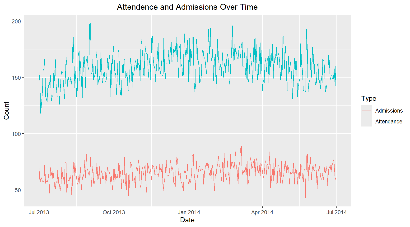
8. Single day
I am now asked to plot the attendance and admissions for a single day of the week and to compare with another day of the week. I have chosen Wednesdays and Saturdays, to see if there is any difference between midweek and weekend. ### Compare the attendance and addmissions on different days of the week
hospital_data_long_wkday = hospital_data_long |>
  mutate(weekday=wday(date, label=TRUE))


hospital_data_long_wkday |>
  filter(weekday %in% c("Wed", "Sat")) |>
  ggplot(aes(x=date, y=count, color=Type, group=Type)) +
  geom_line() +
  facet_wrap(~ weekday, ncol=2, scales="fixed") +
  labs(title="Attendance and Admissions on Wednesdays and Saturdays",
       x="Date", y="Count") +
  theme(plot.title=element_text(hjust=0.5), panel.spacing=unit(2, "lines"))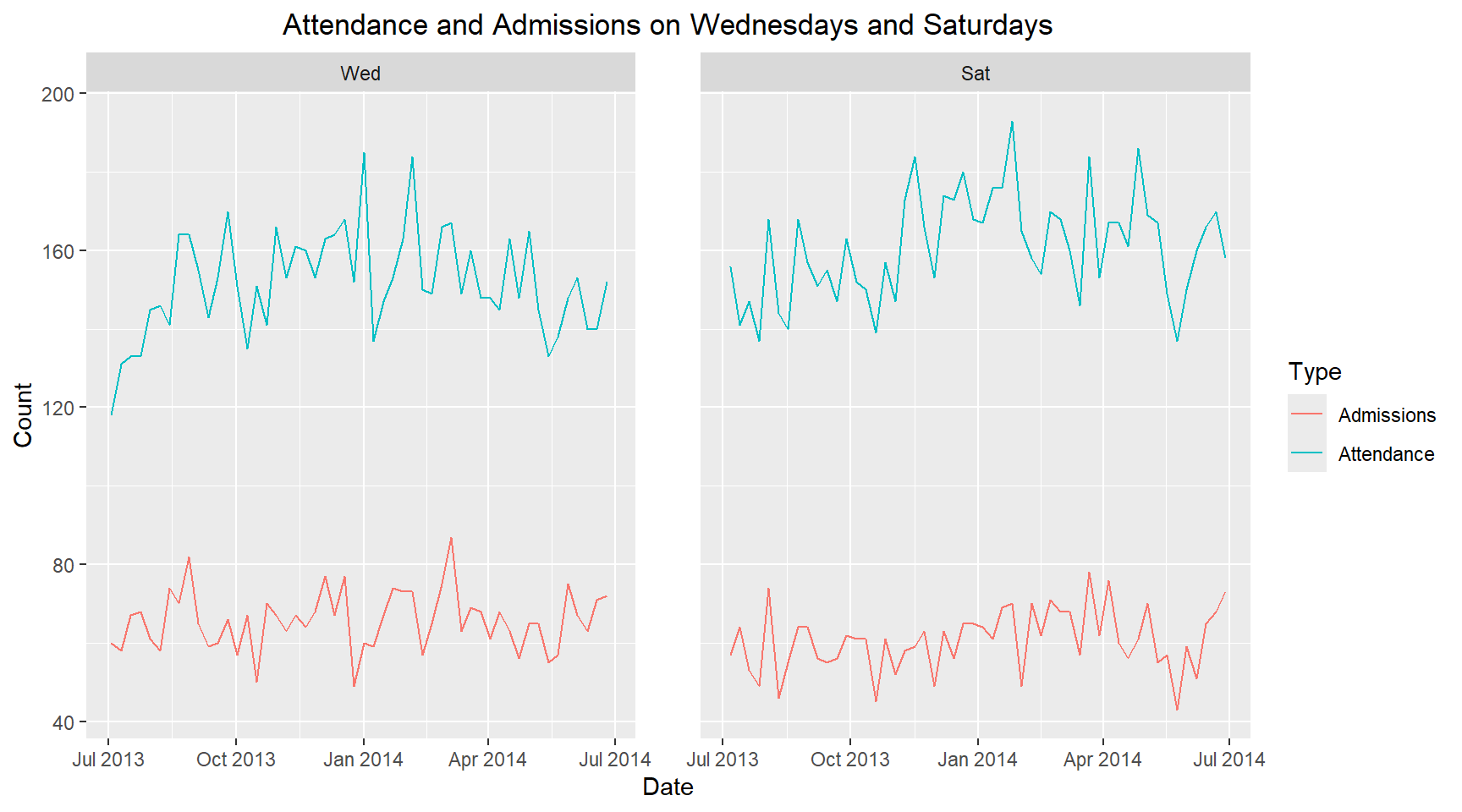
It is observed that the attendance on Wednesdays is lower than Saturdays. However, the admissions on Wednesdays is higher than Saturdays. Therefore, there is is a different in hospital attendance and admissions midweek compared to weekends.