description = 'Darrin William Stephens, SIT741: Statistical Data Analysis, Task T04.P4'Exploratory Data Analysis
Introduction
In this task, has two parts. The first part involves generating data from a binomial distribution and using MLE to estimate the parameters of a Normal distribution that matches the data. The second part involves the use of exploratory data analysis and linear model creation.
Part 1 Task steps
1. Define a string and print it
This section defines a string containing my name, the unit name and the task name.
Print the string using the cat() function.
cat(description)Darrin William Stephens, SIT741: Statistical Data Analysis, Task T04.P42. Random data observations from a Binomial distribution
Generate 30 random data observations from a binomial distribution with the number of trials equal to 10 and a probability of success = 0.7.
3. Plot the histogram of the distribution
The histogram from the sampling is plotted as well as the PMF for a binomial distribution with 10 trials and probability of 0.7. The PMF is added to the plot using the stat_function(). Since the binomial distribution is discrete random variables, the input for the function provided to the stat_func() needs to be rounded to whole numbers.
# Create a function to be used in the stat_function()
# Note, the use of round in the function to use only whole numbers
dbinom_10_7 = function(x) {dbinom(round(x), size=10, prob=0.7)}

tibble(x = x) |>
  ggplot(aes(x)) +
  geom_histogram(aes(y = after_stat(density)), binwidth=1, fill="lightblue", color="black") +
  xlim(0, 10) +
  stat_function(
    fun = dbinom_10_7,
    n = 1000,
    color = 'red',
    linewidth = 1.2
  ) +
  scale_x_continuous(breaks = pretty(0:10, n = 11), limits = c(0, 10)) +
  labs(title = "Binomial PMF (n = 10, p = 0.7)", y = "Probability") +
  theme(plot.title = element_text(hjust = 0.5))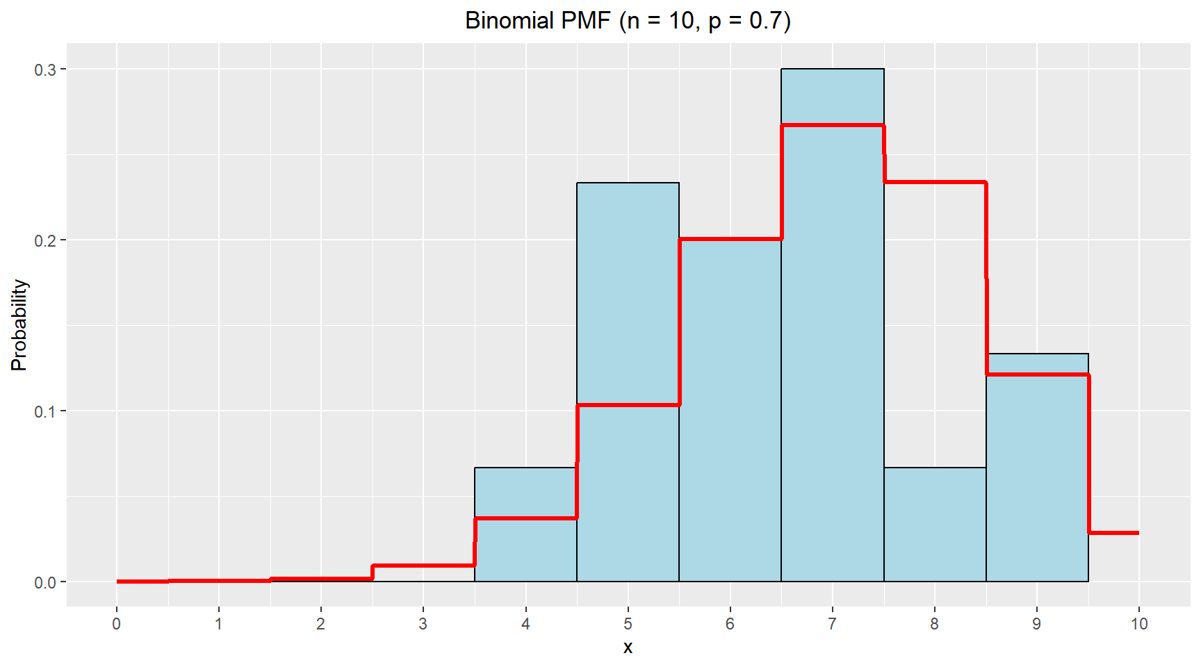
4. Estimate parameters of a Normal distribution that matches the data
In this section, I use MLE to estimate the parameters of a Normal distribution that would match the observed data.
library(bbmle)
library(broom)

# Negative log-likelihood function
nll = function(mu, sigma){
  - sum(dnorm(x, mean=mu, sd=sigma, log=TRUE))
}

# Fit the normal distribution to the data using MLE
fitted_norm = mle2(nll, start=list(mu=6, sigma=2))

# Print the estimates
tidy(fitted_norm)
# A tibble: 2 × 5
term estimate std.error statistic p.value
<chr> <dbl> <dbl> <dbl> <dbl>
1 mu 6.47 0.261 24.7 3.54e-135
2 sigma 1.43 0.185 7.75 9.49e- 15Theoretical values from binomial distribution with p = 0.7 and n = 10:
- \(\mu= n*p = 10*0.7 = 7.0\)
- \(\sigma = \sqrt{(n*p*(1 - p))}=\sqrt{(10*0.7*(1 - 0.7))}=\sqrt{2.1}\approx1.449\)
The table above shows the estimated values for the mean and standard deviation for the Normal distribution are very close the the theoretical values from the binomial distribution. This suggests that for moderate values of n, a normal approximation is quite reasonable.
Now, I’ll increase the trials to 100 and repeat the comparison.
set.seed(42)
# Sample from the distribution
x_new = rbinom(n=30, size=100, prob=0.7)

# Negative log-likelihood function
nll = function(mu, sigma){
  - sum(dnorm(x=x_new, mean=mu, sd=sigma, log=TRUE))
}

# Fit the normal distribution to the data using MLE
fitted_norm = mle2(nll, start=list(mu=65, sigma=5))

# Print the estimates
tidy(fitted_norm)
# A tibble: 2 × 5
term estimate std.error statistic p.value
<chr> <dbl> <dbl> <dbl> <dbl>
1 mu 68.6 0.790 86.8 0
2 sigma 4.33 0.558 7.75 9.49e-15Theoretical values from binomial distribution with p = 0.7 and n = 100:
- \(\mu= n*p = 100*0.7 = 70.0\)
- \(\sigma = \sqrt{(n*p*(1 - p))}=\sqrt{(100*0.7*(1 - 0.7))}=\sqrt{21}\approx 4.583\)
With more trials, the binomial distribution becomes more symmetric and the normal approximation improves. The MLE estimates are again very close, though the standard deviation is slightly underestimated.
Part 2 Task steps
This section uses data on abalone from https://archive.ics.uci.edu/dataset/1/abalone.
5. Read the data
Read the data and rename columns to have appropriate labels.
abalone = read.table("http://archive.ics.uci.edu/ml/machine-learning-databases/abalone/abalone.data", sep = ",")

# Rename columns
abalone_df = abalone |>
  rename(
    sex = V1,
    length = V2,
    diameter = V3,
    height = V4,
    whole_weight = V5,
    shucked_weight = V6,
    viscera_weight = V7,
    shell_weight = V8,
    rings = V9
  )

glimpse(abalone_df)
Rows: 4,177
Columns: 9
$ sex <chr> "M", "M", "F", "M", "I", "I", "F", "F", "M", "F", "F", …
$ length <dbl> 0.455, 0.350, 0.530, 0.440, 0.330, 0.425, 0.530, 0.545,…
$ diameter <dbl> 0.365, 0.265, 0.420, 0.365, 0.255, 0.300, 0.415, 0.425,…
$ height <dbl> 0.095, 0.090, 0.135, 0.125, 0.080, 0.095, 0.150, 0.125,…
$ whole_weight <dbl> 0.5140, 0.2255, 0.6770, 0.5160, 0.2050, 0.3515, 0.7775,…
$ shucked_weight <dbl> 0.2245, 0.0995, 0.2565, 0.2155, 0.0895, 0.1410, 0.2370,…
$ viscera_weight <dbl> 0.1010, 0.0485, 0.1415, 0.1140, 0.0395, 0.0775, 0.1415,…
$ shell_weight <dbl> 0.150, 0.070, 0.210, 0.155, 0.055, 0.120, 0.330, 0.260,…
$ rings <int> 15, 7, 9, 10, 7, 8, 20, 16, 9, 19, 14, 10, 11, 10, 10, …6. Exploratory Data Analysis
In this section various plots are prodced to explore the data and possible relationships between features.
Multi-grid barplot showing distribution of age for each sex
abalone_df |>
  ggplot(aes(x = age, fill = sex)) +
  geom_bar(color = "darkgray") +
  facet_wrap(~sex) +
  scale_fill_manual(values = c("F" = "hotpink", "M" = "steelblue", "I" = "yellow")) +
  labs(title = "Distribution of Age by Sex", x = "Age (years)", y = "Count") +
  theme(plot.title = element_text(hjust = 0.5))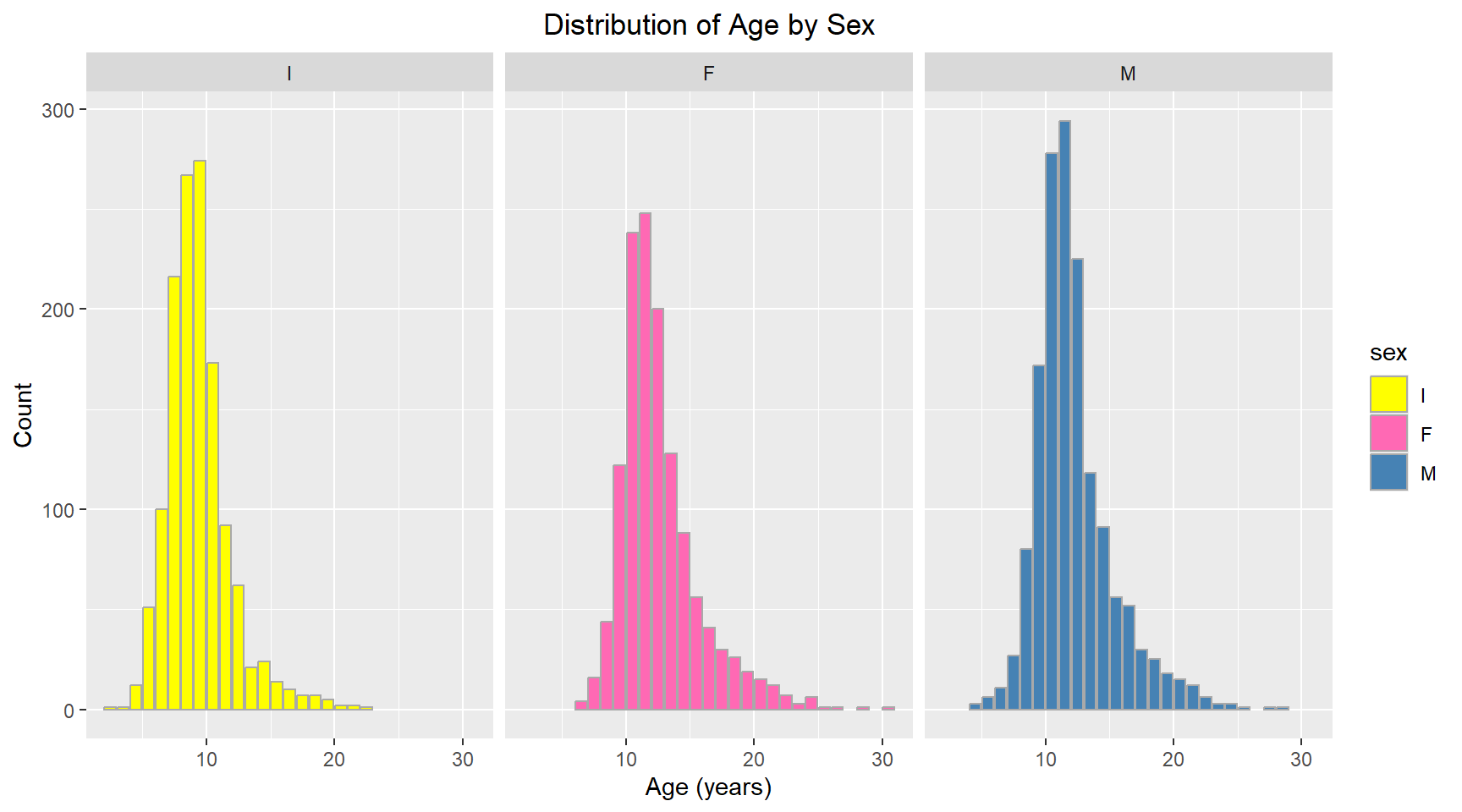
Comparative violin plot of Sex vs Length
abalone_df |>
  ggplot(aes(x = sex, y = length, fill = sex)) +
  geom_violin(trim = FALSE) +
  scale_fill_manual(values = c("F" = "hotpink", "M" = "steelblue", "I" = "yellow")) +
  labs(title = "Violin Plot of Length by Sex", x = "Sex", y = "Length (mm)") +
  theme(plot.title = element_text(hjust = 0.5))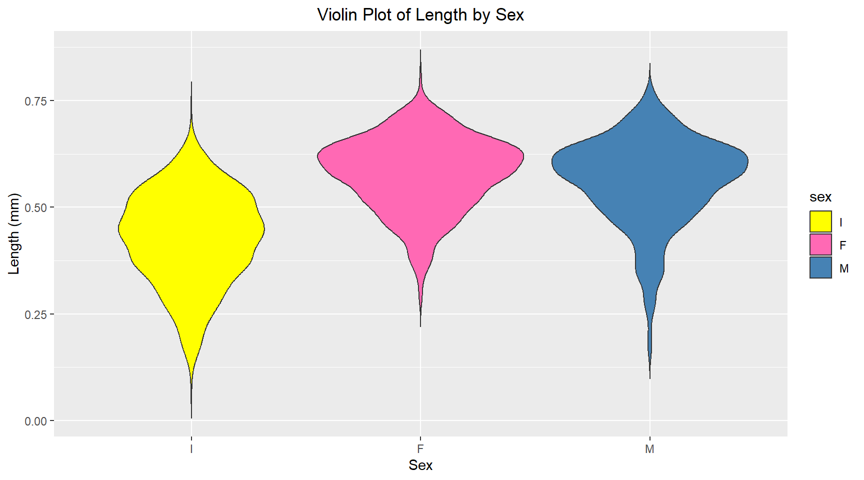
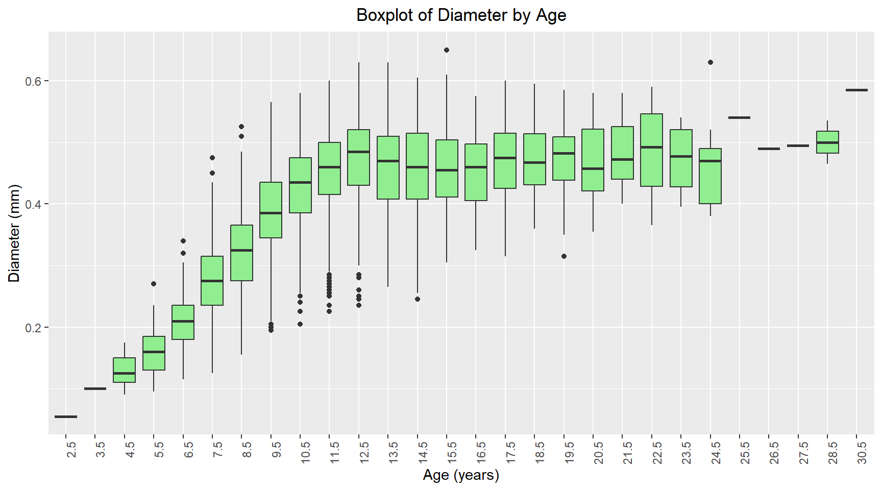
Comparative boxplot of Age vs Diameter
# Convert age to a factor for boxplot
abalone_df = abalone_df |>
  mutate(age_factor = factor(age))

abalone_df |>
  ggplot(aes(x = age_factor, y = diameter)) +
  geom_boxplot(fill = "lightgreen") +
  labs(title = "Boxplot of Diameter by Age", x = "Age (years)", y = "Diameter (mm)") +
  theme(
    axis.text.x = element_text(angle = 90, hjust = 1),
    plot.title = element_text(hjust = 0.5)
    )
Scatterplot of Height vs Age for Females with linear trendline
abalone_df |>
  filter(sex == "F") |>
  ggplot(aes(x = age, y = shell_weight)) +
  geom_point(alpha = 0.5) +
  geom_smooth(method = "lm", se = FALSE, color = "hotpink",linewidth = 1.2) +
  labs(title = "Shell Weight vs Age for Female Abalones", x = "Age (years)", y = "Shell Weight (grams)") +
  theme(plot.title = element_text(hjust = 0.5))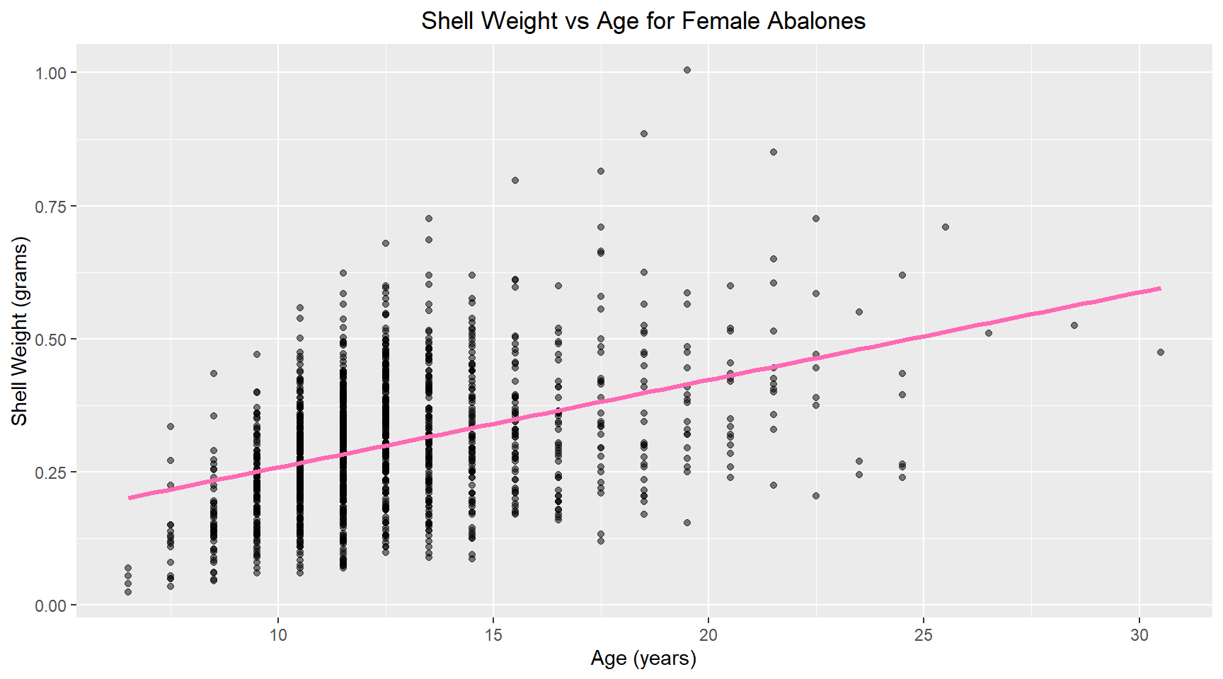
7. Linear model
Now I build a linear model of shell weight versus age for female abalone. The model coefficients are shown below.
library(broom)
female_abalone = abalone_df |>
  filter(sex == "F")

# Build linear model
model= lm(shell_weight ~ age, data = female_abalone)

# Print coefficients
tidy(model)
# A tibble: 2 × 5
term estimate std.error statistic p.value
<chr> <dbl> <dbl> <dbl> <dbl>
1 (Intercept) 0.0945 0.0133 7.10 2.08e-12
2 age 0.0164 0.00102 16.0 5.20e-53